
Supply and demand graph maker
Lucidchart is an intelligent diagramming application that helps you visualize your data. Graph supply and demand easily so you can make plans for your business, and update your graph in real time as you collaborate and add fresh data.


By registering, you agree to our Terms of Service and you acknowledge that you have read and understand our Privacy Policy.


Make your supply and demand graph online
Learn how our supply and demand graph creator can help you make and collaborate on graphs.

Integrate with your favorite apps

Manage and implement changes in real time

Work on your graph anywhere

Share and collaborate

See why people love Lucidchart
Learn to use Lucidchart
master the basics of Lucidchart in 5 minutes
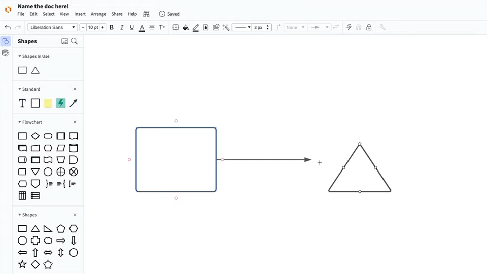
- Make a supply and demand graph from a template or blank canvas, or import a document.
- Add shapes to your graph, connect them with lines, and add text.
- Format and style your supply and demand graph to make it look just right.
- Locate any feature you need with Feature Find.
- Share your graph with your team, and invite them to collaborate with you.
Supply and demand graph templates
Use one of our templates to get a head start on your graph.
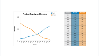
Supply and demand graph with smart tables template
Go to Supply and demand graph with smart tables template template

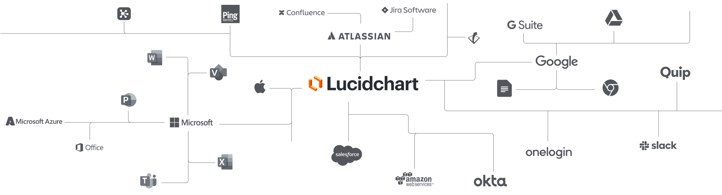
Lucidchart integrations
Connect Lucidchart to all your favorite industry-leading apps.
See why teams use Lucidchart
Diagram, visualize data, and collaborate all in one platform.

Collaboration
Clarity
Alignment

Better together
What is a supply and demand graph?
A supply and demand graph charts two types of data: the amount of supply available to consumers for purchasing and the amount of demand consumers have for that product. As supply rises, prices go down, and consumer demand rises, prices drive up. This graph charts both curves so you can see where they intersect and make smart decisions about your pricing accordingly.
How to make a supply and demand graph in Lucidchart
Choose a template or start from a blank canvas
Select a Lucidchart template to fill out or start a graph from scratch.
Add shapes and lines
Drag out shapes and lines to visualize your supply and demand numbers.
Link to data
Link shapes to data you have in Excel, Google Sheets, or a CSV, or add a Smart Table that's linked to your data.
Label and adjust the axis values
Customize the values and labels for the x-axis and y-axis of your graph.
Manage, style, and share
Once you've created your graph, you can manage it like any Lucidchart shape, including adjusting the formatting. You can also make changes to your data set directly from the data panel.