Boring Meetings? Not with Diagrams as Visual Aids
Lucid Content
Reading time: about 4 min
Topics:
Today's post is written by Alexandrea Roman.
Imagine going to a meeting where a presenter flashes a text-filled PowerPoint slide on the projector and proceeds to read aloud every word. Doesn't that sound dull? It's the kind of meeting that can't end soon enough, as you suppress your yawns and your urge to bolt out of the room.
A meeting should stimulate minds and encourage strategic thinking, not lull people to sleep. Visual aids play a key role in making meetings interesting. They catch and engage interest, enabling participants to get more involved in discussions.
So for your next meeting, consider using visual aids—specifically diagrams—to help get your point across.
Yes, diagrams. You read that right. They're not just a mandatory part of math classes from your younger years; they also serve a practical purpose in business because they're reliable visual representations of information. If it's been a while since you last used diagrams and you need a quick refresher for your next meeting, here's a handy reference guide.
1. The Venn diagram is represented by overlapping circles. It shows all possible interrelationships—or lack thereof—between two or more groups. The Venn diagram was originally used for exploring logical relations between mathematical sets, but it has proven useful in presenting business concepts as well, such as connections among elements that influence a process. Interestingly, it's also a popular fixture on Internet humor sites, which says something about its versatility. 
2. The organizational chart depicts the overall structure of an organization. It also shows reporting relationships, management functions, job titles, and authority lines. Organizational charts are helpful for workforce planning, job analysis, and organizational restructuring. It's a great management tool for explaining company goals to employees, especially when it also includes responsibility structure.
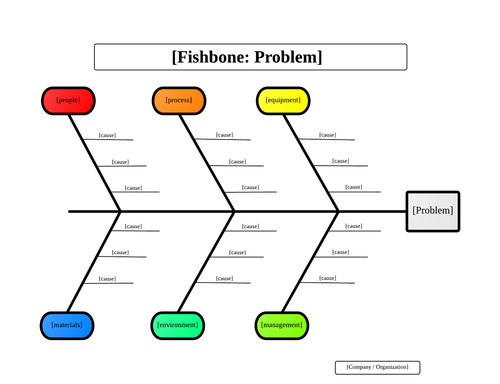
3. The fishbone diagram is used to dissect complex problems. As its name suggests, it looks like a fishbone, with the head representing the problem and the bones representing reasons why the problem exists. It's the best chart to use for root cause analysis (RCA) because it lets you lay out interrelated causes and their effects. Because of this, the fishbone diagram is also called the cause-and-effect diagram. Another moniker is the Ishikawa diagram, in honor of Kaoru Ishikawa, a Japanese professor who popularized it in the 60s.
4. The flowchart presents a step-by-step process. Steps are represented by shapes, while sequences are represented by arrows. A flowchart isn't strictly linear; it also covers different conditions and the steps that branch out from each one of them. So you only need one diagram to cover all possible versions of a process. Even complicated processes are easy to understand in flowchart form because you simply follow the arrows.
5. The data flow diagram shows how data moves through an information system. Using this diagram, you can present what kind of data a system accepts and produces, where the data comes from, and where it will eventually be stored. In a way, the data flow diagram looks like a flowchart, except that it does not cover a procedure, but rather a structure that shows how a system works and how it will be implemented. Although often used for information systems, the data flow diagram can also be used to build a model of an organization's core business processes.
The great thing about these diagrams is that they're now easy to create, publish, and share, thanks to online chart and diagram solutions like Lucidchart. You can even invite other people to work on these diagrams with you in real-time before you present them for a meeting. That's collaboration at its best!
If you want to take collaboration one step further and make your meetings even more engaging, try out an enterprise meeting solution like Anywhere Pad. It enables fully interactive meetings by keeping participants on track with real-time page sync and laser pointer. The charts you've worked on with Lucidchart can be better appreciated by your audience when you use Anywhere Pad.
Lucidchart
Lucidchart, a cloud-based intelligent diagramming application, is a core component of Lucid Software's Visual Collaboration Suite. This intuitive, cloud-based solution empowers teams to collaborate in real-time to build flowcharts, mockups, UML diagrams, customer journey maps, and more. Lucidchart propels teams forward to build the future faster. Lucid is proud to serve top businesses around the world, including customers such as Google, GE, and NBC Universal, and 99% of the Fortune 500. Lucid partners with industry leaders, including Google, Atlassian, and Microsoft. Since its founding, Lucid has received numerous awards for its products, business, and workplace culture. For more information, visit lucidchart.com.
Related articles
 How to Make a Fishbone Diagram in Word
Learn how to make a fishbone diagram in Microsoft Word. Use this guide to make a fishbone diagram directly in Word using Shapes or with the Lucidchart add-in. Templates included!
 How to make a Venn diagram in Google Docs
You need to know how to make a Venn diagram in Google Docs. We've got you covered. Check out our tutorial with free templates!