
Infographic maker
Use Lucidchart to create a free infographic. Start with one of our infographic templates to clearly visualize anything from your data, information, and processes.


By registering, you agree to our Terms of Service and you acknowledge that you have read and understand our Privacy Policy.


Infographic creator for data visualization
Get started in minutes with our simple, intuitive infographic maker.

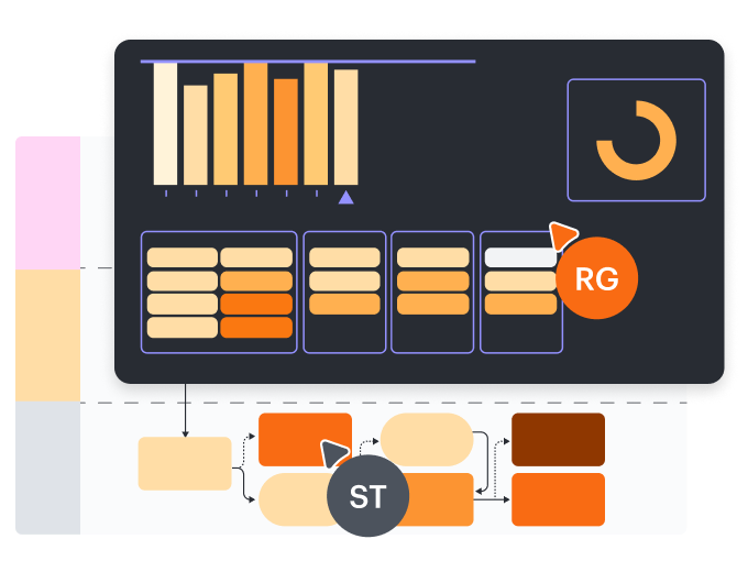
Versatile infographics
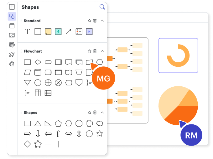
Free templates and shape libraries
Data linking

Easy to use

Data visualization in real time
Master the basics of Lucidchart in 3 minutes
master the basics of Lucidchart in 5 minutes
- Create an infographic from a free template or a blank canvas.
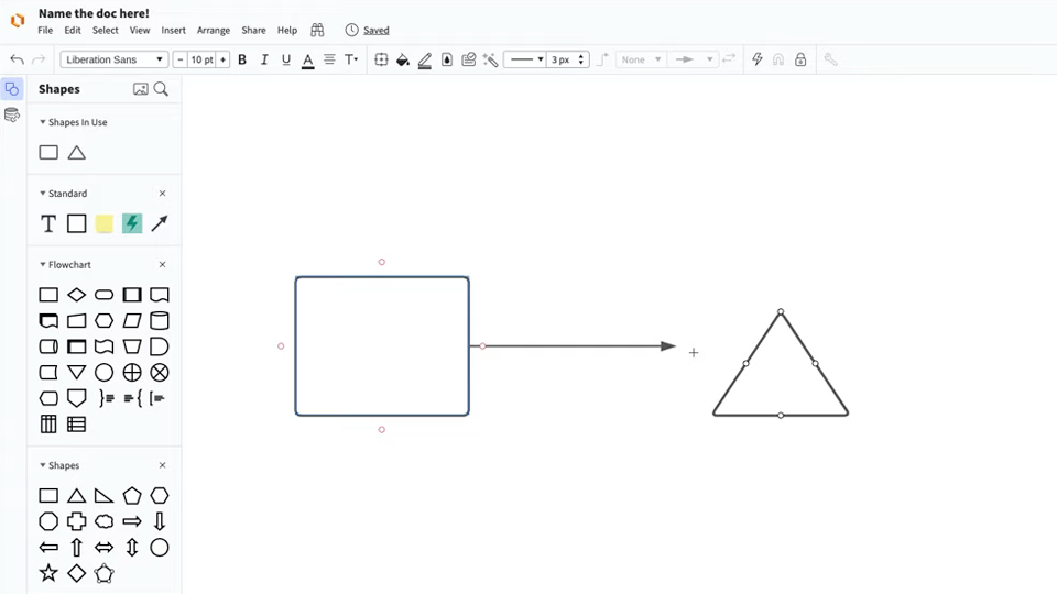
- Add text, shapes, and lines to customize your infographic.
- Learn how to adjust styling and formatting within your infographic template.
- Locate what you need to create an infographic with Feature Find.
- Share your infographic with your team and start collaborating.
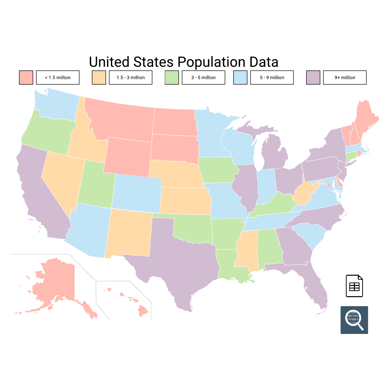
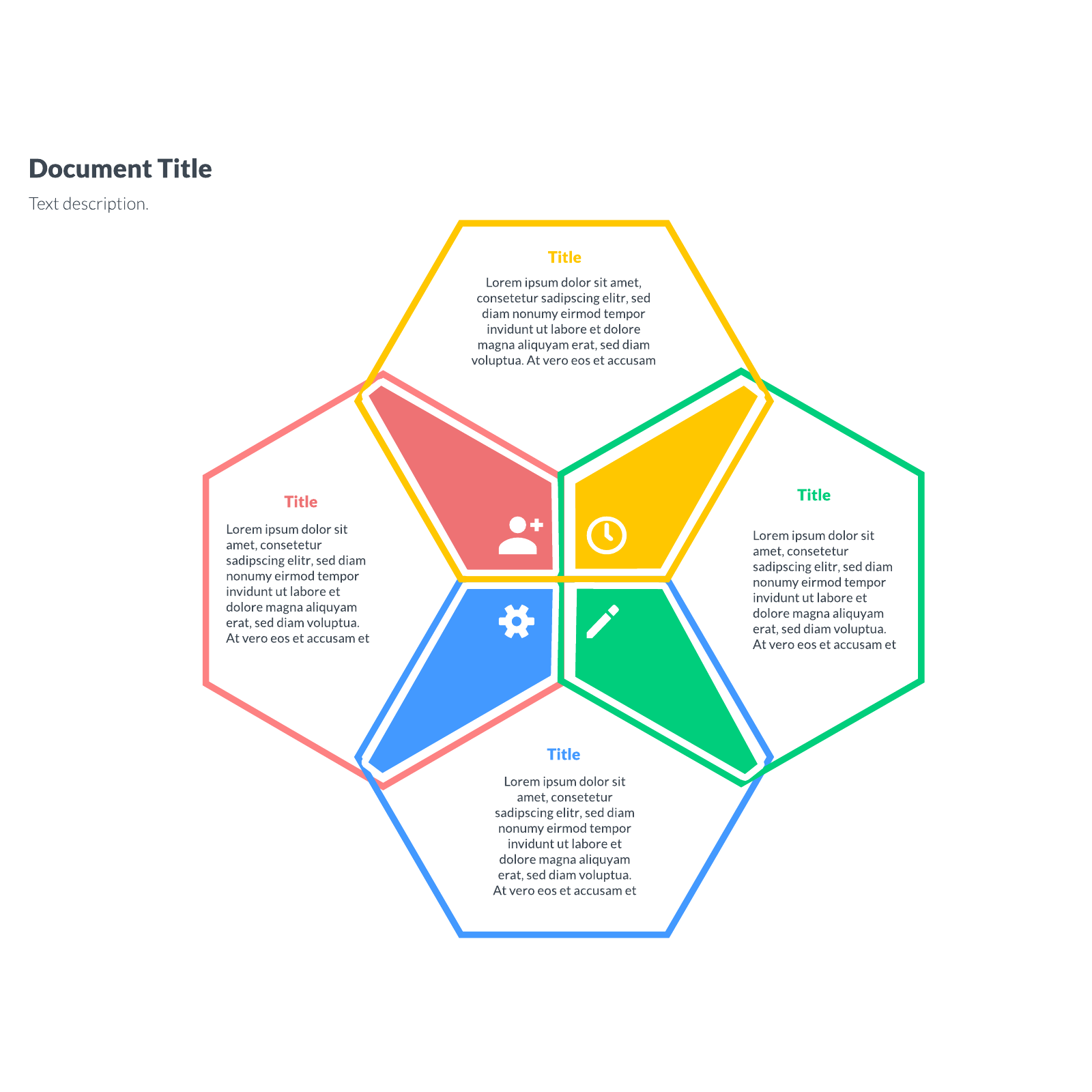
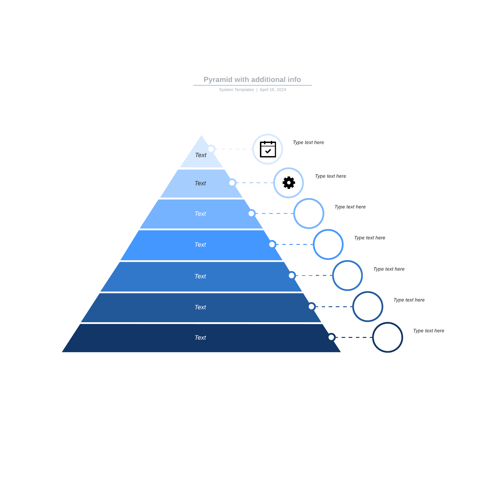
Free infographic templates
Create an infographic from one of our free templates.
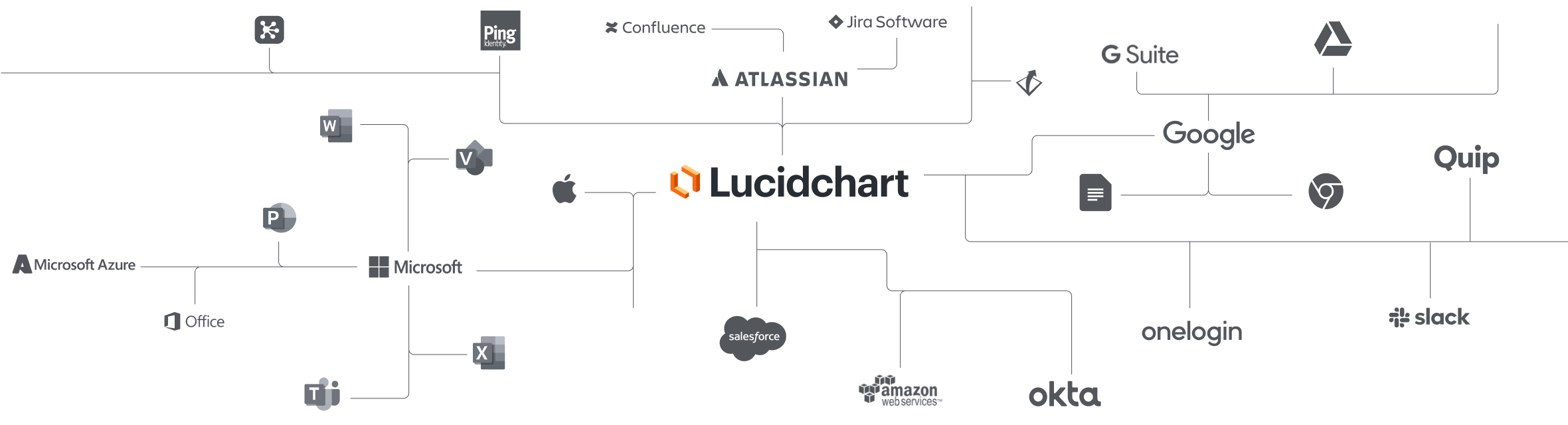
Lucidchart integrations
Connect Lucidchart to your favorite industry-leading apps.
See why teams use Lucidchart
Diagram, create an infographic, and collaborate all in one platform.

Collaboration

Clarity

Alignment

Better together
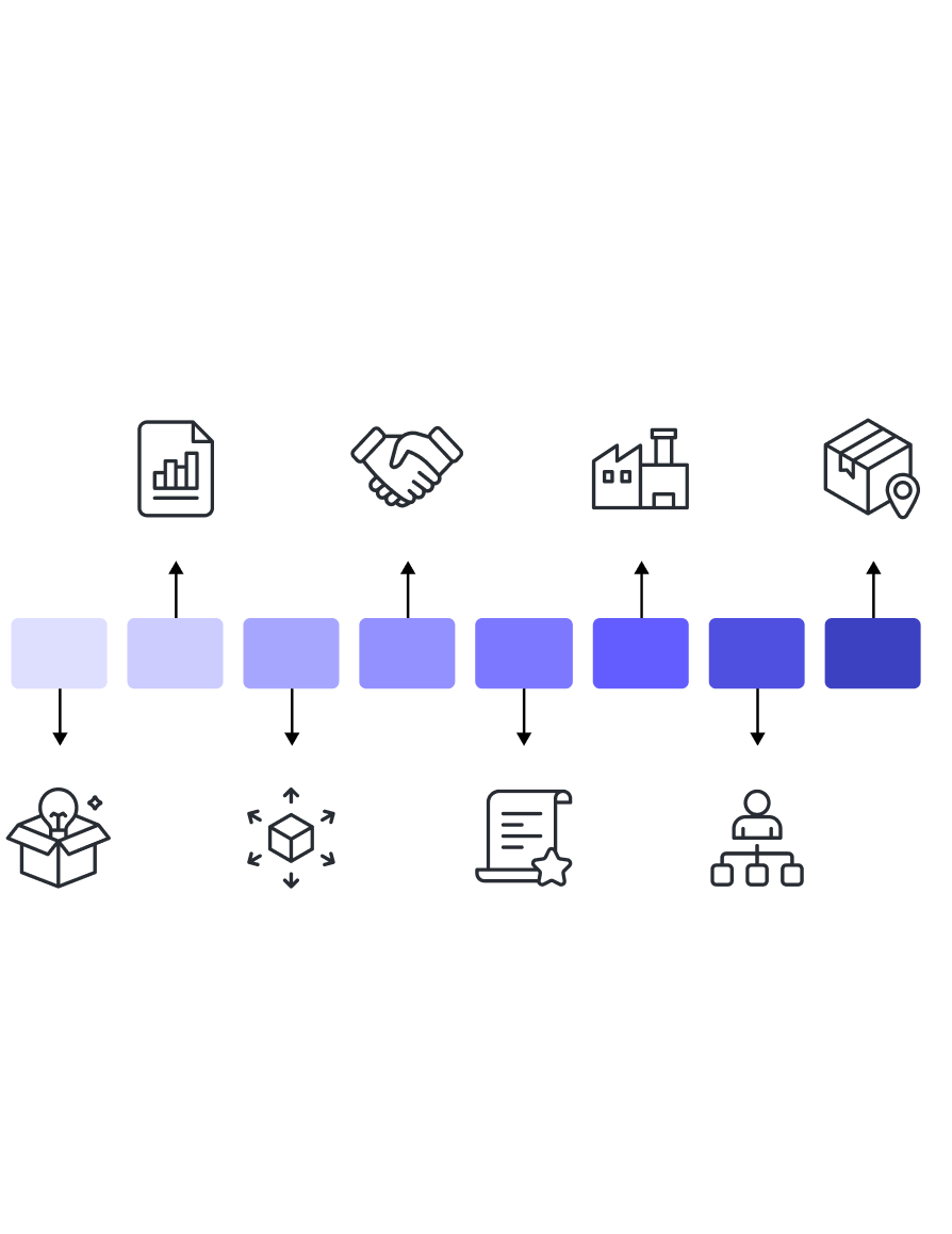
What is an infographic?
An infographic is the visualization of information, data, or knowledge through graphs and diagrams. Infographics are designed to help you easily understand your data at a glance. Infographics are popular because they increase clarity and can help you to identify patterns and trends.
How to create an infographic in Lucidchart
Gather your data and define the purpose of your infographic
Before you begin creating your infographic, identify the information you want to convey and which data source you will use.
Select a free template
Choose from one of Lucidchart’s many infographic templates. If you already have your own template and want to update it, simply import your diagram from Lucidspark, Visio, Gliffy, Omnigraffle, or draw.io into Lucidchart. You can also import datasets from Google Sheets or Excel.
Customize and design your infographic template
Click and drag the shapes you want from the shape library and drop them anywhere on the canvas. Simply click a shape to add text to it, and use the available formatting options to customize shapes, colors, and text. You can also add images to make your infographic design unique.
Link data
Keep your infographic up to date by adding live data with our data linking feature.
Collaborate
Once you’ve created your infographic, it’s time to share it with stakeholders so they can give feedback, ask questions, and make edits before presenting or publishing.
Present, publish, and share your infographic
After you’ve polished your infographic, you can publish it as a PDF or an image. To present, you can convert your graph into a slide and present it directly from Lucidchart or export it to Google Slides.