swimlane diagrams

Webisodes with Alec Sharp: Swimlane diagrams tips, tricks, and best practices

Reading time: about 8 min

Topics:

  • Diagramming

Effective project managers need to have an array of management tools and strategies at their disposal. Everyone processes information differently, and as a manager, it’s your job to ensure each team member receives and understands the information required to do their job. 

Easier said than done, right? To help address this challenge, managers across a variety of industries rely on visuals. 

There are dozens of types of diagrams that can be used in a business setting, but in Alec Sharp’s fifth and sixth webisodes with Lucidchart, he focuses on one: swimlane diagrams. Swimlane diagrams are versatile—they can be as simple or as complex as needed—and easy to understand. And when it comes to illustrating business processes, they should be your bread and butter! Let’s take a look at why. 

What is a swimlane diagram?

Before getting into anything else, it’s crucial that you have a basic understanding of what a swimlane diagram is. 

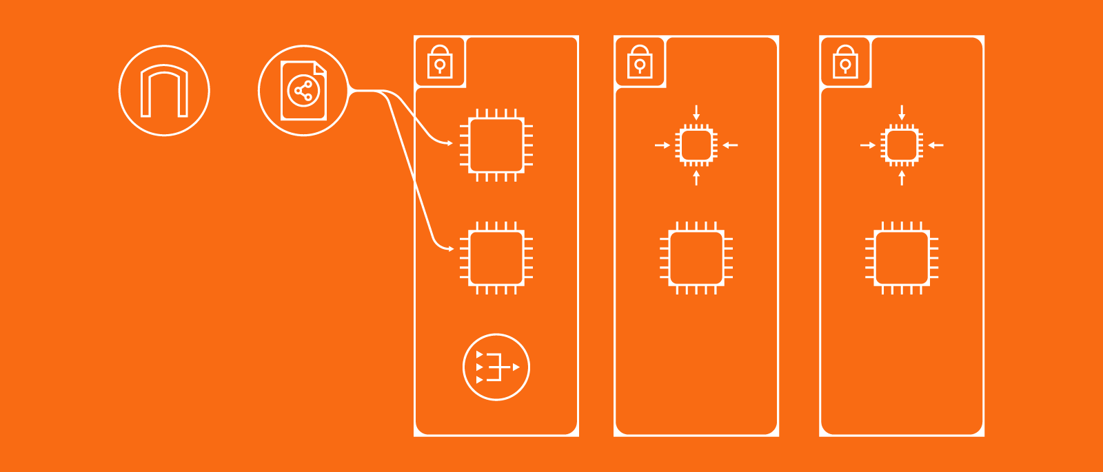
A swimlane diagram is a visual representation of a process. In this case, a business process. There are countless aspects to any given process. If you tried to illustrate them all, the resulting diagram would be cluttered and difficult to understand. Swimlane diagrams, on the other hand, focus on just three aspects of a process: who, what, and when. 

In a swimlane diagram, tasks (the “what” of a process) are written on cards which are then placed in sequential order in a larger box. That box is broken into lanes—these lanes delineate who is responsible for each task. Each task is connected using arrows to show the process flow. Or, in other words, the “when” of each task. 

Benefits of a swimlane diagram

As we mentioned before, swimlane diagrams are, for the most part, simple. And because they’re simple, they’re easy to understand. This may seem like a small benefit, but swimlane diagrams actually achieve something pretty remarkable. Let’s unpack it.

Processes are often complex—that’s why we need diagrams to illustrate them. If you explain a process (even a short one) with words, you’re looking at several paragraphs (maybe even pages) of dense text. And in all that text, it’s easy to lose the details: Who is responsible for what? When does this task need to be accomplished? And so on. 

Swimlane diagrams take all of that information and put it into a single document. They include only essential text and use visuals to show sequence and dependency. 

Levels of detail for process models 

Swimlane diagrams are part of a larger category of diagrams known as process models. Process models are broken into three levels—scope, concept, and detail—based on the amount of detail they contain. It’s tempting to think that the more detail a diagram contains, the better it is. But that line of thinking is a one-way ticket to confusing, crowded diagrams. 

There’s a time and a place for each level of detail. After all, not every stakeholder needs to know the minute steps needed to complete a process. They might simply need to see a simplified version to give the go-ahead. 

Let’s take a look at each level of detail for process models and their respective use cases.

Scope

The first level of detail for process models, scope, is typically used in planning. This level of detail includes diagrams such as augmented scope models, but more on those later. You can create these diagrams using only boxes. 

Scope level diagrams focus almost exclusively on the “what” of a process: What steps need to be completed to move through the process?

Concept

The goal of concept-level process models is understanding. As team members, coworkers, and other stakeholders look at a concept-level diagram, they should understand what needs to happen, who is responsible for making each step happen, and the order of those steps. 

In other words, concept-level diagrams are business-friendly swimlane diagrams. They can be created using only boxes and lines, and you don’t need any expertise or prior knowledge to understand them. 

As you begin to create a concept level process model, your focus should be on sequence and handoffs. To ensure you’re including the necessary information, ask yourself these three questions:

  1. Who gets the work next?
  2. How does it get there?
  3. Who really gets the work next?

The first question ensures you are looking at flow—how is work moving through the process? After each task, ask it again: Who gets the work next? Once you’ve completed a first pass, move on to the next two questions. They are designed to help uncover additional actors and steps you may have initially missed.

Detail

The final category of process models is detail-level diagrams. Here, the focus is on specifics. These diagrams, which are usually reserved for technical design, are made up of lines, boxes, and widgets (widgets are essentially symbols). 

Detail-level process models often use full BPMN notation and symbols, which means they’re only useful to people with the necessary background knowledge. 

Getting the most from swimlane diagrams

If you’re going to make a swimlane diagram, you might as well do it right. Fortunately, it’s not too hard to create a killer swimlane, especially with these tips and best practices. 

Show the flow of work 

In episode 5 of his webinar series, Alec Sharp drops this nugget of wisdom: “The purpose of a workflow model is to show the flow of work.” It might seem like an obvious thing to say, but you won’t want to forget it.

If you lose sight of that goal—showing the flow of work—there’s a good chance your diagram will be ineffective. To keep your sights on target, remember to keep your diagram simple and accurate. You don’t need lots of colors, confusing flows, or a maze-like route through your swimlane diagram. 

Your diagram should flow naturally from left to right. Avoid attaching arrows to the top or bottom of boxes, as this will complicate the flow. If you’re worried about keeping your diagram on one page, don’t. If you need a one-pager, use a less detailed diagram type. 

Start with an augmented scope model

Augmented scope diagrams are a scope-level process model. They include some of the same information as a swimlane diagram, but take the complexity down a notch. To create an augmented scope model, start with the “what.” List main tasks in order, placing each task in its own box. These boxes should form a horizontal line. 

As you list these tasks, keep your language simple. Try to use only one verb and a noun. Underneath those main tasks, create bulleted lists of subtasks. 

Augmented scope diagrams are a great jumping off point as you create more detailed swimlane diagrams, but they have another benefit as well. Remember how we said swimlanes shouldn’t be one-pagers? If you do need a one-pager, an augmented scope model is a great option.

The cognitive psychology of diagramming 

If you’re not a psychology expert, don’t worry! Neither are we. But, as Sharp explains, you can still use the psychology behind diagramming to your advantage. So what exactly does this mean? 

As people look at diagrams, they notice some things before others. And, almost instantaneously, they begin trying to extract meaning from the diagram. In other words, they’re trying to interpret visual information. As the creator of the diagram, you don’t want to lead your audience astray. 

To ensure your diagram is communicating exactly what you want it to, remember these considerations:

  • Size: People interpret bigger things as more important. If some of your boxes are larger than others, people will automatically impose a hierarchy to your diagram: the biggest boxes are the most important and the smallest are least important. Maintain a consistent size throughout your diagram unless you are intentionally using size to add meaning. 
  • X-Y position: Swimlane diagrams depend on two axes to organize information. The x-axis, which runs horizontally, denotes sequence dependency. That’s just a fancy way of saying the x-axis is like a timeline. Viewers will assume the process flows from left to right.

    The y-axis, which runs vertically, is used to denote various actors. The axis is broken into swimlanes. Tasks in each swimlane correspond to a specific actor. 
  • Less is more: It’s easy to go overboard with diagrams. As you create a swimlane repeat this mantra to yourself: less is more. Include crucial information, but avoid crowding your diagram because a crowded diagram is hard to interpret. 

With these tips and tricks, you’ll be on your way to creating more useful swimlane diagrams.

swimlane diagrams

Watch Alec Sharp’s entire webisode series on our YouTube page.

Watch now

Lucidchart

Lucidchart, a cloud-based intelligent diagramming application, is a core component of Lucid Software's Visual Collaboration Suite. This intuitive, cloud-based solution empowers teams to collaborate in real-time to build flowcharts, mockups, UML diagrams, customer journey maps, and more. Lucidchart propels teams forward to build the future faster. Lucid is proud to serve top businesses around the world, including customers such as Google, GE, and NBC Universal, and 99% of the Fortune 500. Lucid partners with industry leaders, including Google, Atlassian, and Microsoft. Since its founding, Lucid has received numerous awards for its products, business, and workplace culture. For more information, visit lucidchart.com.

Related articles

Bring your bright ideas to life.

Sign up free

or continue with

Sign in with GoogleSign inSign in with MicrosoftSign inSign in with SlackSign in

Get started

  • Pricing
  • Individual
  • Team
  • Enterprise
  • Contact sales
PrivacyLegal

© 2024 Lucid Software Inc.