Why would someone make a histogram instead of a bar chart?
While both types of graphs illustrate data, they have different purposes. Bar graphs compare categories of items against each other, while histograms show how many times something has happened. In other words, bar graphs show the variance between categories, while histograms help you visualize numerical data.
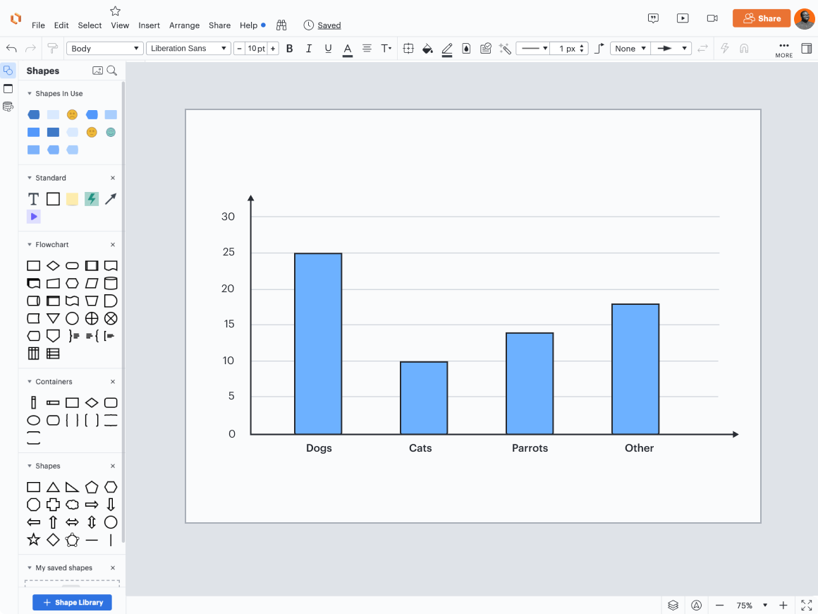
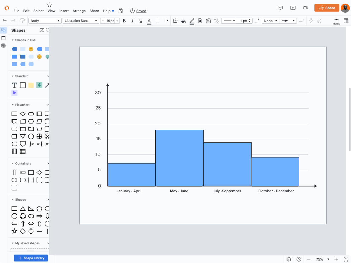
These visuals also look slightly different. A bar graph has space between the bars, and the bars are of equal width. A histogram has no space between bars and the bars may be of unequal width.
Additionally, while you can reorder the bars without changing the meaning of the bar chart, you can’t reorder the columns in a histogram since that would mess up the ranges. For instance, while you could reorder the animal species in our bar graph example and the chart would still be perfectly clear, you could not reorder the time periods in our histogram example. That would lead to months or years being out of order, and it would be very confusing for the viewer.
Bar chart vs. histogram: What are the use cases?
Each type of visualization has different use cases. Let’s explore them below.
Bar graphs
Bar graphs are a great choice if you need to make comparisons between categories. Generally, people have a very easy time interpreting the length of the bars, so they’ll understand the information in the graph quickly.
Bar graphs are also a great choice when you need to show rankings. For example, if you want to show categories from highest to lowest or vice versa, use a bar graph to show the amount for each category in the ranking so people can easily see not just what comes out on top, but by how much. For example, if you used a bar graph to rank Olympic women’s gymnasts in terms of their gold medal count, you’d be able to see how far and away Simone Biles is from the rest of the competition.
However, bar graphs are not a great choice when you need people to grasp precise numbers quickly. Bar graphs excel at showing overall comparisons, not for helping viewers see the specifics. If you want your viewer to come away remembering Simone Biles’s medal count and not just that she has more medals than everyone else, you should choose another method for presenting your data.
Histograms
Histograms only work for data that falls within a continuous numerical range and not for qualitative data.
Histograms are ideal for analyzing data because the graph shows you so much information at a glance—since both the width and the height of the bars matter, you can see the shape of your dataset easily. This makes histograms perfect for spotting patterns and outliers.
For example, a marketing team may use a histogram to take a look at how customers respond to different prices. They could plot the price on one axis and the amount of sales on the other, which would easily show them if their discount program is working.
Visualize data with Lucidchart
When you’re ready to create a bar graph, histogram, or another type of visualization, use Lucidchart. To get started quickly, choose one of our templates, such as this bar graph template. Customize the template and add a diagram key to provide the viewer with more context.