What is a control chart?
A control chart—sometimes called a Shewhart chart, a statistical process control chart, or an SPC chart—is one of several graphical tools typically used in quality control analysis to understand how a process changes over time.
The main elements of a control chart include:
- A visual time series graph that illustrates data points collected at specific time intervals.
- A horizontal control line to more easily visualize variations and trends.
- Horizontal lines, representing upper and lower control limits, placed at equal distances above and below the control line. These upper and lower limits are calculated from the data that is recorded on the time series graph over a specified period of time.
Benefits of using a control chart
Control charts can help you:
- Understand the variations that are always present in processes: Variations within your control limits indicate that the process is working. Variations that spike outside of your control limits indicate problems that you need to correct.
- See when something is going wrong or may go wrong: These problem indicators let you know that you need to take corrective action.
- Notice patterns within plotted points: The patterns indicate possible causes, which can help you find possible solutions.
- Predict future performance: By closely examining your process’s variations, you’re more likely to understand how it will perform in the future.
- Generate new ideas for improving quality: You can find new ways to improve your process based on your analysis.
Understanding process variation
Before you can build your control chart, you will need to understand different types of process variation so you can monitor whether your process is stable. Variations can come from common causes and special causes.
Common cause variations
Common cause variations are predictable and always present in your processes.
As an example, consider how long it takes you to commute to work every morning. You may drive the same route every morning, but the drive is never the same. Perhaps it takes you an average of 20 minutes from the time you leave your house until you pull into the parking lot. Due to common cause variations—such as stop lights and traffic congestion—some days it will take less time and other days it will take more time.
Even though you don’t know exactly when you will get to work tomorrow, you know that it will fall within an acceptable time frame and you will arrive on time.
When variations stay within your upper and lower limits, there is no urgent need to change your process because everything is working within predictable parameters.
Special cause variations
Special cause variations are usually sporadic and unpredictable. For example, running out of gas, engine failure, or a flat tire could extend your commute by an hour or more, but these types of special causes will not happen every day.
When special cause variations occur, it’s still a good idea to analyze what went wrong to see if these anomalies can be prevented in the future. In our commuting example, you could make sure you stop at a gas station when you’re running low on gas and make sure your vehicle is well maintained to ensure proper operation.
How to make a control chart
Control charts are a great way to separate common cause variations from special cause variations. With a control chart, you can monitor a process variable over time.
Follow these steps to get started:
- Decide on a time period, typically noted on the X-axis of the control chart, to collect the necessary data and establish your control limits.
- Collect your data and plot it on the control chart.
- Calculate the average of your data and add a control line.
- Calculate upper and lower control limits and add these lines in your chart, ideally in a different color or style.
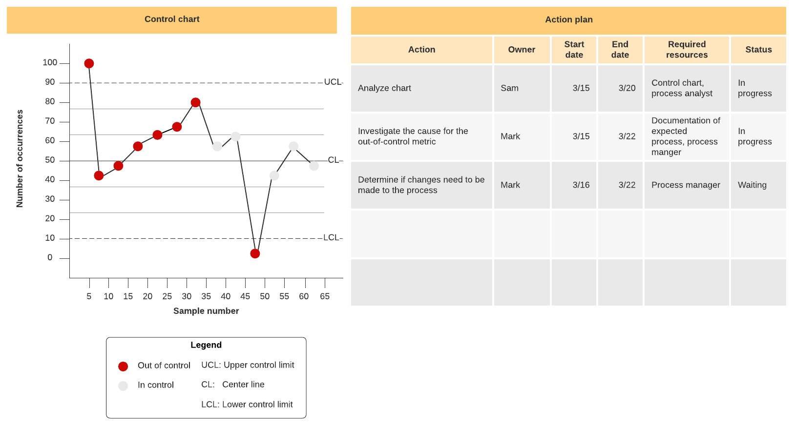
- Note any “out-of-control signals,” or places where your data falls outside of your control limits. Investigate the cause and adjust your process to minimize risk of these abnormalities.
- With your control limits in mind, continue to track your process.
Don’t worry—we’ll walk through all of these steps with our commute example.
For example, let’s say you want to record the amount of time it takes to commute to work every day for a set number of days. Every day you measure the amount of time it takes from the moment you leave your house until you pull into the parking lot. After the data is plotted on a control chart, you can calculate the average time it takes to complete the commute.
The control chart below is a simple visual aid for plotting the amount of time your commute takes over 25 days.

In our example, you collected data for 25 consecutive days. The calculated average indicates that it takes 24.9 minutes on average to make the trip each day. This average becomes your control line (CL), shown in green.
How to calculate upper and lower control limits
After you have calculated the average, you can calculate your control limits. The upper control limit (UCL) is the longest amount of time you would expect the commute to take when common causes are present. The lower control limit (LCL) is the smallest value you would expect the commute to take with common causes of variation.
To calculate control limits, follow these steps:
- Subtract the average number from the number you recorded for each day and square the result. (For example, our Day 1 calculation would be 23 - 24.9 = -1.9 x -1.9 = 3.61.)
- Find the average of all the squared results.
- Find the square root of that result. The square root is the standard deviation.
- Determine how many standard deviations you want to fall within your controlled process. The upper and lower limits in a well-controlled process are equal to +3 and -3 standard deviations from the average.
In the example, we end up with a standard deviation of 6.9. Our upper control limit is 45.6 minutes (24.9 + 6.9 + 6.9 + 6.9), and the lower control limit is 4.2 minutes (24.9 - 6.9 - 6.9 - 6.9), shown in red on the control chart example.
As long as all of the points plotted on the chart are within the control limits, the process is considered to be in statistical control. That’s great news for your business—there is no urgent need for change. You can always make improvements, but operating within the control limits is an admirable goal.
The points that fall outside of your control limits indicate the times that the process was out of control. If these out-of-control points happen rarely, you need to look at them to analyze what went wrong and to plan for fixing them in the future. If the process hits out-of-control points often, this could indicate a pattern you need to address.