What are the 7 basic quality tools, and how can they change your business for the better?
Reading time: about 6 min
Topics:
The ability to identify and resolve quality-related issues quickly and efficiently is essential to anyone working in quality assurance or process improvement. But statistical quality control can quickly get complex and unwieldy for the average person, making training and quality assurance more difficult to scale.
Thankfully, engineers have discovered that most quality control problems can be solved by following a few key fundamentals. These fundamentals are called the seven basic tools of quality.
With these basic quality tools in your arsenal, you can easily manage the quality of your product or process, no matter what industry you serve.
Learn about these quality management tools and find templates to start using them quickly.
Where did the quality tools originate?
Kaoru Ishikawa, a Japanese professor of engineering, originally developed the seven quality tools (sometimes called the 7 QC tools) in the 1950s to help workers of various technical backgrounds implement effective quality control measures.
At the time, training programs in statistical quality control were complex and intimidating to workers with non-technical backgrounds. This made it difficult to standardize effective quality control across operations. Companies found that simplifying the training to user-friendly fundamentals—or seven quality tools—ensured better performance at scale
Today, these quality management tools are still considered the gold standard for troubleshooting a variety of quality issues. They’re frequently implemented in conjunction with today’s most widely used process improvement methodologies, including various phases of Six Sigma, TQM, continuous improvement processes, and Lean management.
7 quality tools
1. Check sheet (or tally sheet)
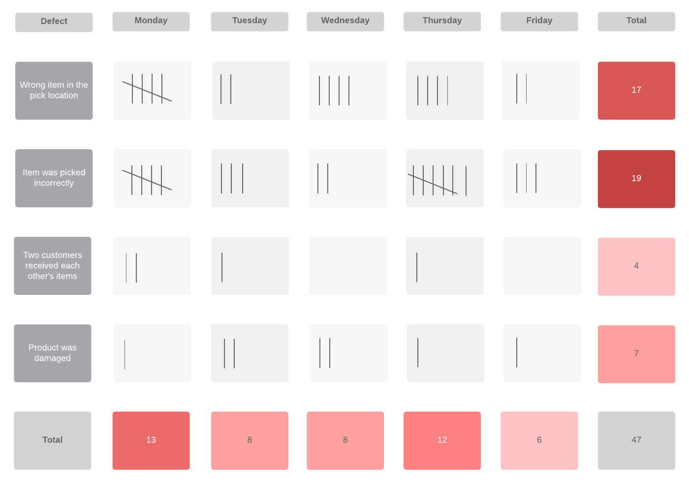
Check sheets can be used to collect quantitative or qualitative data. When used to collect quantitative data, they can be called a tally sheet. A check sheet collects data in the form of check or tally marks that indicate how many times a particular value has occurred, allowing you to quickly zero in on defects or errors within your process or product, defect patterns, and even causes of specific defects.
With its simple setup and easy-to-read graphics, check sheets make it easy to record preliminary frequency distribution data when measuring out processes. This particular graphic can be used as a preliminary data collection tool when creating histograms, bar graphs, and other quality tools.
2. Cause-and-effect diagram (also known as a fishbone or Ishikawa diagram)
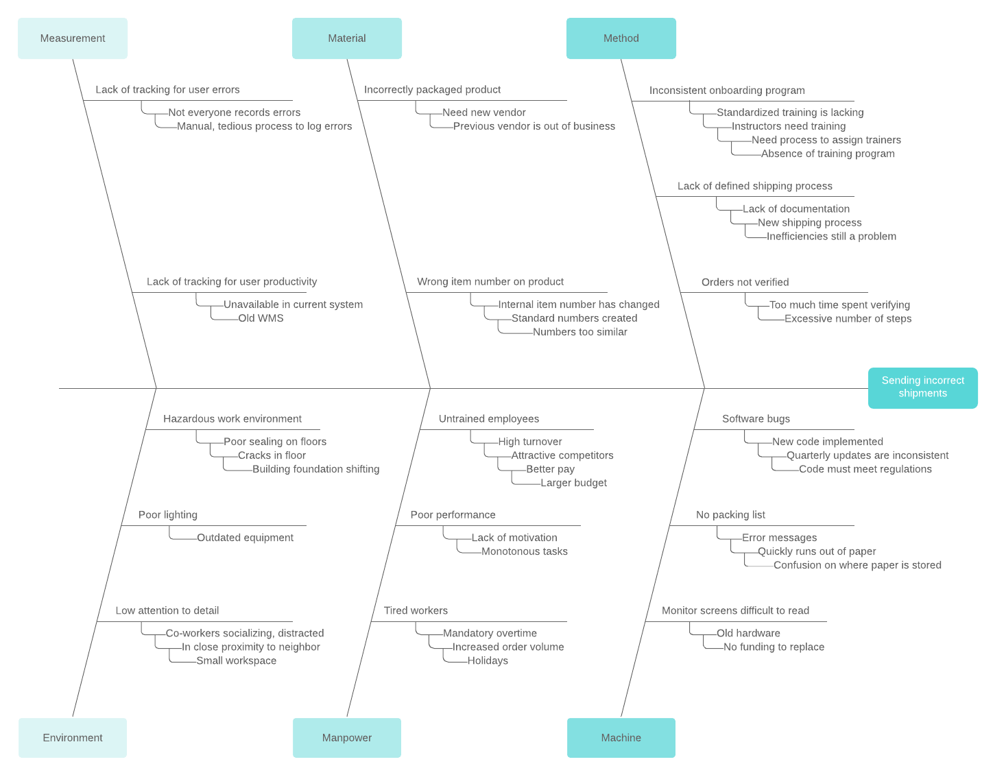
Introduced by Kaoru Ishikawa, the fishbone diagram helps users identify the various factors (or causes) leading to an effect, usually depicted as a problem to be solved. Named for its resemblance to a fishbone, this quality management tool works by defining a quality-related problem on the right-hand side of the diagram, with individual root causes and sub-causes branching off to its left.
A fishbone diagram’s causes and subcauses are usually grouped into six main groups, including measurements, materials, personnel, environment, methods, and machines. These categories can help you identify the probable source of your problem while keeping your diagram structured and orderly.
3. Stratification
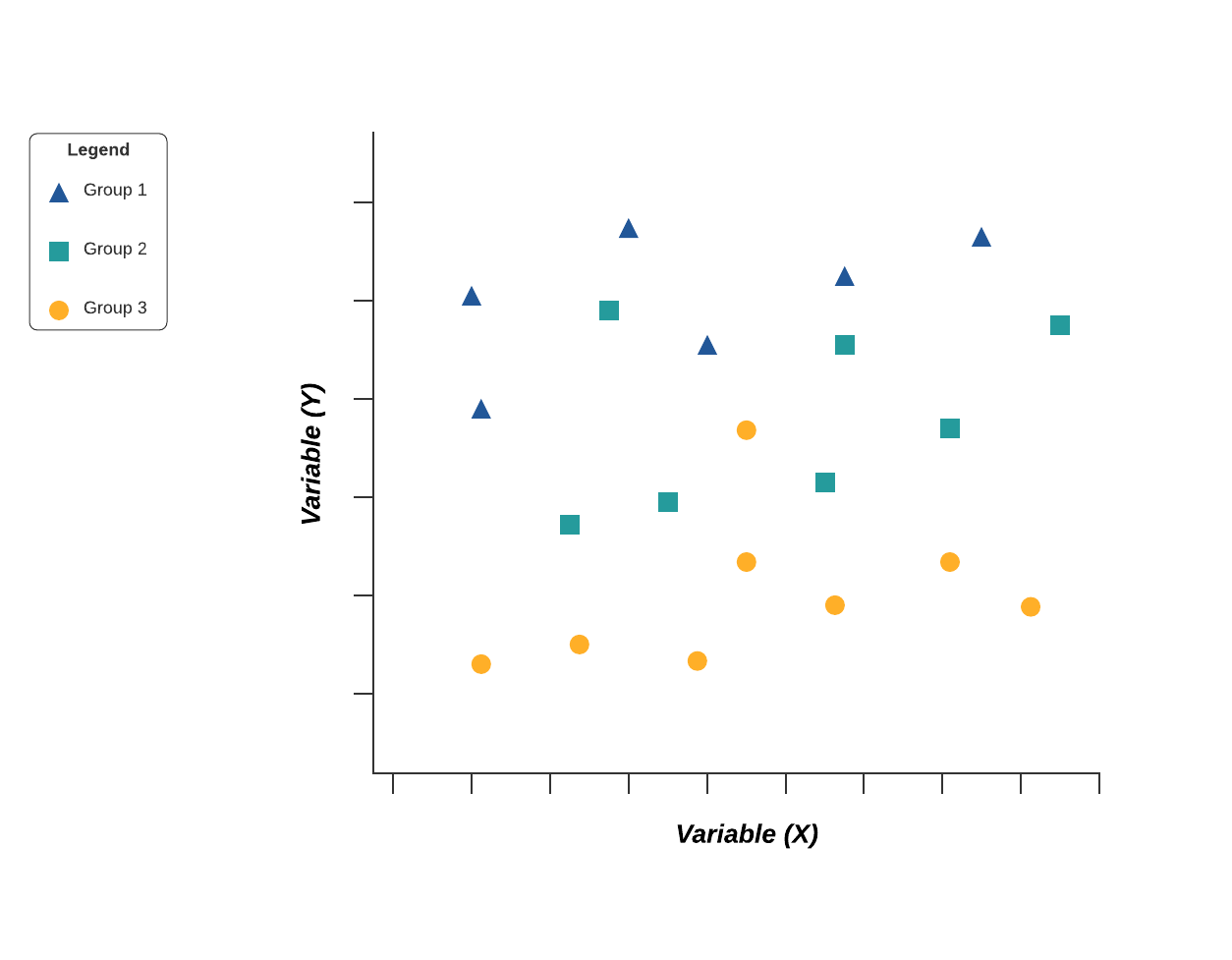
Stratification analysis is a quality assurance tool used to sort data, objects, and people into separate and distinct groups. Separating your data using stratification can help you determine its meaning, revealing patterns that might not otherwise be visible when it’s been lumped together.
Whether you’re looking at equipment, products, shifts, materials, or even days of the week, stratification analysis lets you make sense of your data before, during, and after its collection.
To get the most out of the stratification process, consider which information about your data’s sources may affect the end results of your data analysis. Make sure to set up your data collection so that that information is included.
4. Histogram
Quality professionals are often tasked with analyzing and interpreting the behavior of different groups of data in an effort to manage quality. This is where quality control tools like the histogram come into play.
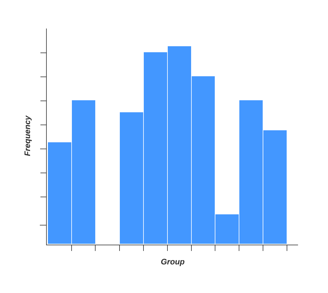
The histogram represents frequency distribution of data clearly and concisely amongst different groups of a sample, allowing you to quickly and easily identify areas of improvement within your processes. With a structure similar to a bar graph, each bar within a histogram represents a group, while the height of the bar represents the frequency of data within that group.
Histograms are particularly helpful when breaking down the frequency of your data into categories such as age, days of the week, physical measurements, or any other category that can be listed in chronological or numerical order.
5. Pareto chart (80-20 rule)
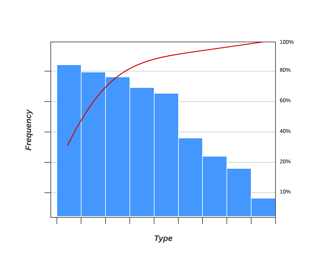
As a quality control tool, the Pareto chart operates according to the 80-20 rule. This rule assumes that in any process, 80% of a process’s or system’s problems are caused by 20% of major factors, often referred to as the “vital few.” The remaining 20% of problems are caused by 80% of minor factors.
A combination of a bar and line graph, the Pareto chart depicts individual values in descending order using bars, while the cumulative total is represented by the line.
The goal of the Pareto chart is to highlight the relative importance of a variety of parameters, allowing you to identify and focus your efforts on the factors with the biggest impact on a specific part of a process or system.
6. Scatter diagram
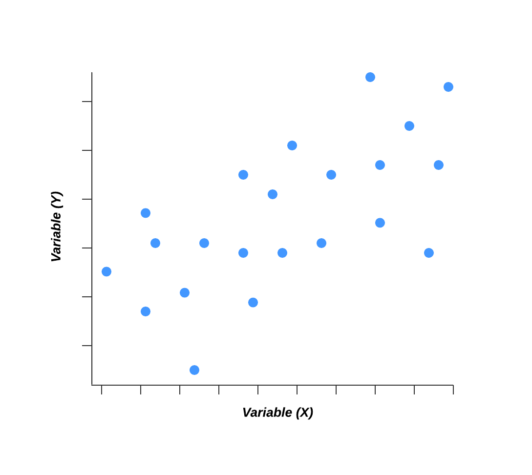
Out of the seven quality tools, the scatter diagram is most useful in depicting the relationship between two variables, which is ideal for quality assurance professionals trying to identify cause and effect relationships.
With dependent values on the diagram’s Y-axis and independent values on the X-axis, each dot represents a common intersection point. When joined, these dots can highlight the relationship between the two variables. The stronger the correlation in your diagram, the stronger the relationship between variables.
Scatter diagrams can prove useful as a quality control tool when used to define relationships between quality defects and possible causes such as environment, activity, personnel, and other variables. Once the relationship between a particular defect and its cause has been established, you can implement focused solutions with (hopefully) better outcomes.
7. Control chart (also called a Shewhart chart)
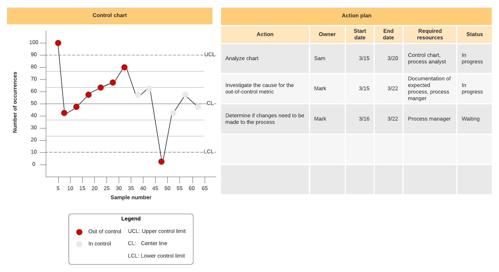
Named after Walter A. Shewhart, this quality improvement tool can help quality assurance professionals determine whether or not a process is stable and predictable, making it easy for you to identify factors that might lead to variations or defects.
Control charts use a central line to depict an average or mean, as well as an upper and lower line to depict upper and lower control limits based on historical data. By comparing historical data to data collected from your current process, you can determine whether your current process is controlled or affected by specific variations.
Using a control chart can save your organization time and money by predicting process performance, particularly in terms of what your customer or organization expects in your final product.
Bonus: Flowcharts
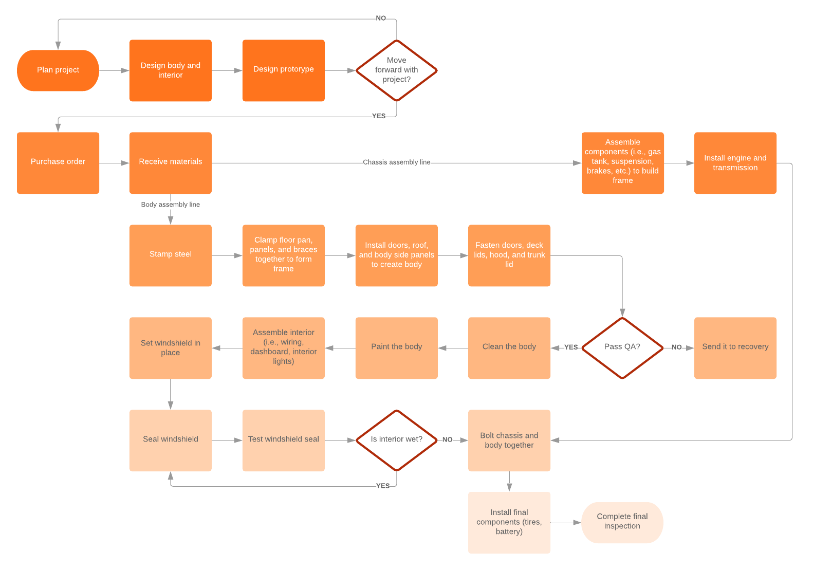
Some sources will swap out stratification to instead include flowcharts as one of the seven basic QC tools. Flowcharts are most commonly used to document organizational structures and process flows, making them ideal for identifying bottlenecks and unnecessary steps within your process or system.
Mapping out your current process can help you to more effectively pinpoint which activities are completed when and by whom, how processes flow from one department or task to another, and which steps can be eliminated to streamline your process.

Learn how to create a process improvement plan in seven steps.
Go nowAbout Lucidchart
Lucidchart, a cloud-based intelligent diagramming application, is a core component of Lucid Software's Visual Collaboration Suite. This intuitive, cloud-based solution empowers teams to collaborate in real-time to build flowcharts, mockups, UML diagrams, customer journey maps, and more. Lucidchart propels teams forward to build the future faster. Lucid is proud to serve top businesses around the world, including customers such as Google, GE, and NBC Universal, and 99% of the Fortune 500. Lucid partners with industry leaders, including Google, Atlassian, and Microsoft. Since its founding, Lucid has received numerous awards for its products, business, and workplace culture. For more information, visit lucidchart.com.
Related articles
How to improve process visualization
In this article we’ll talk about how to improve visualization, even if you are not a visual presentation expert.
Which process improvement methodology should you use?
Struggling to decide which process improvement methodology to use? Learn about the top approaches—Six Sigma, Lean, TQM, Just-in-time, and others—and the diagrams that can help you implement these techniques starting today.
Bring your bright ideas to life.
By registering, you agree to our Terms of Service and you acknowledge that you have read and understand our Privacy Policy.
