
Burnup and burndown charts offer a straightforward way to track your team’s work and stay on task with at-a-glance reminders and accountability. For project managers, these charts make it easy to compare actual work completed against goals and timelines.
Since burnup and burndown charts are subtly different from each other, you can use them for different types of projects and use cases.
What is a burnup chart?
A burnup chart shows a team’s project progress over time—project managers and team members can see if the project is still on schedule. Agile methodology often uses visuals such as burn up charts to communicate work progress visually, which makes developing estimates easier. Using a straight line that moves diagonally up the graph, burnup charts are great for emphasizing the progress a team already made. Another line representing the project’s scope serves as a benchmark for measuring progress.
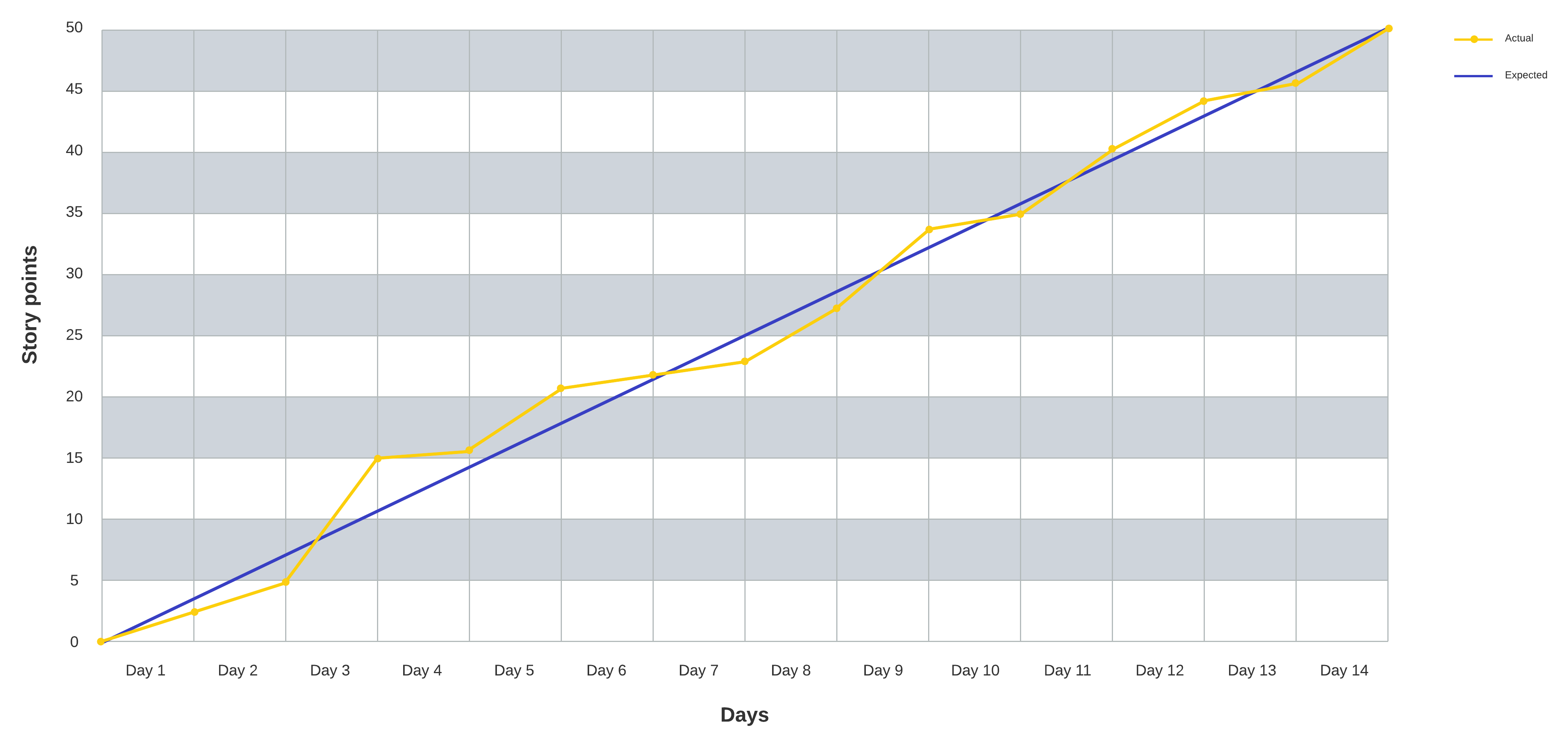
The y-axis shows work and the x-axis shows project time. As the team makes progress on the project, the completed work line reflects how much work is finished at each milestone. The total work line stands in for the project scope.
Using this type of chart, you can plan your project by:
- Breaking down sprints by work completed: Using points, you can specifically quantify the amount of work your team finished during that time period.
- Comparing finished work against scope: To see where the project is compared with where your scope dictates, all you have to do is use the work line and completed line.
- Motivating your team with overall progress: The burn up chart logs increasing progress on the way to reaching the scope, which is a great way to show your team how productive they’ve been throughout the project.
What is a burndown chart?
Similar to a burnup chart, a burndown chart graphs the progress made by the team during a project, but it also depicts the amount of work and time left for the project’s duration. Two lines, one showing an ideal rate of progress and another showing actual progress, start at the same beginning point and progress downward over time.
Your team’s work burns down until the project is over, reaching zero as the sprint ends. At that point, both the time for the project and the work itself have elapsed and completed.
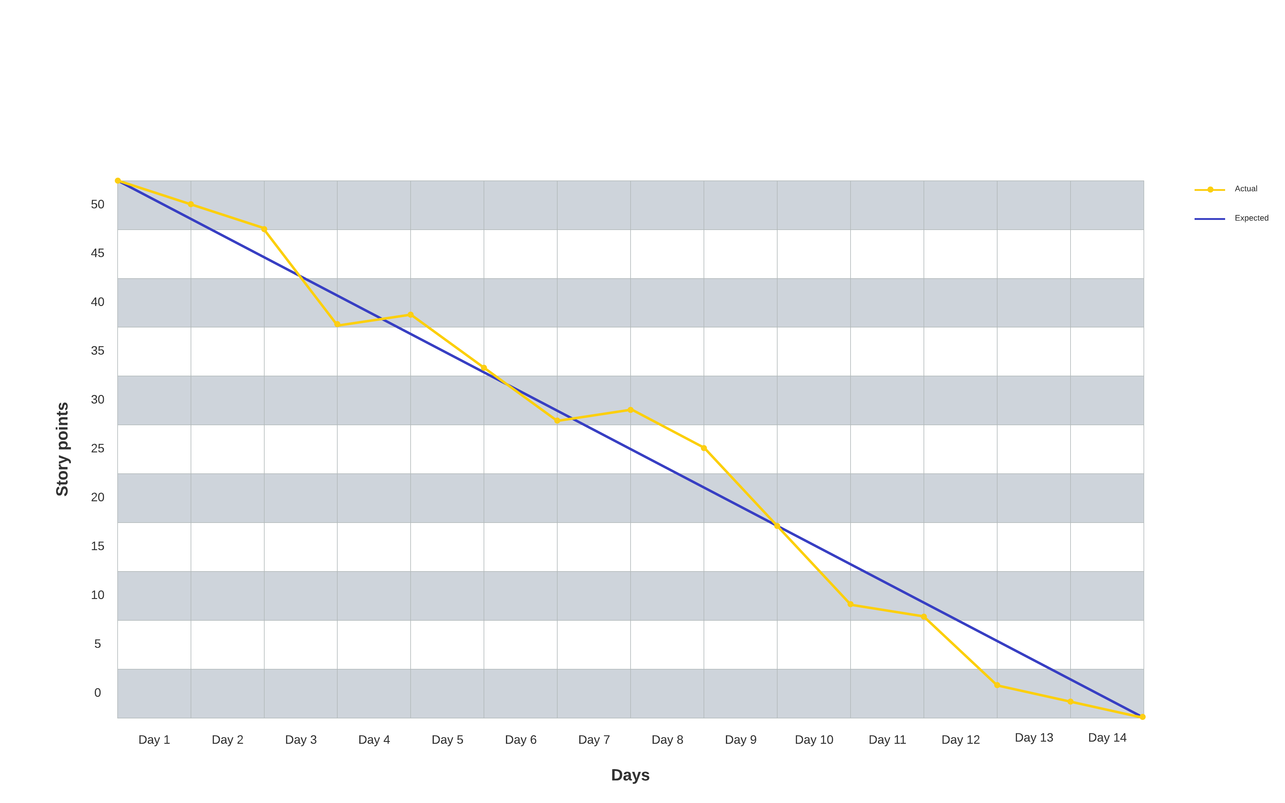
The y-axis shows work to be completed. The x-axis represents the overall timeline. As much as we’d all like for our planning to always go perfectly, sometimes there’s a gap between what the team completes and the ideal completion rate. Burndown charts depict this gap using ideal and actual work lines.
With a burndown chart, you can:
- Create team accountability: Burndown charts help teams focus on what work is left vs. the remaining time, encouraging accountability for the entire project.
- Define on-time completion: Ideal and actual work lines remove ambiguity during phases of the project where the schedule and timelines are otherwise obscured or confusing.
- Adjust estimation and planning: Through experience and experimenting with a burndown chart, you can develop and improve your internal processes for planning future projects.
Using a burnup vs. burndown chart
On paper, burnup and burndown charts may seem like identical concepts, but although they are similar, their differences lend themselves to different use cases. The crucial difference is how the timeline is defined.
Burnup charts start at zero, while burndown charts move towards zero. For this reason, burndown charts essentially presume a deadline. Burnup charts don’t emphasize the deadline but focus on what was accomplished so far as time passed. You can use this to your advantage, choosing a chart based on the type of project you’re working on, the stakeholders involved, and other factors.
Burnup chart use cases
Burnup charts feature an open-ended timeline by default since they track elapsed time instead of counting down to zero. As such, you can use a burnup chart to track your projects that are a bit more flexible, have a lot of dependencies, or are relatively complex—situations where the timeline and scope could be subject to change during the project.
Burndown chart use cases
If you are working with a finite, highly specific timeline, a burndown chart can help you identify and troubleshoot problems early. Any disruption impacting the timeline, whether it places you ahead or behind schedule, will show up as a difference between the lines.
With a burndown chart, since you’re counting down both time and work, scope changes will show up as weak productivity. A project with a lot of uncertainty, possible adjustments, and external influences could be a bad fit for a burndown chart.
Choosing a burnup chart vs. burndown chart
Using what you know about your project, create a chart for your next sprint and keep track of how well it works for your team. Be sure to invite input from other project members. Before getting started, you could ask if they anticipate scope changes or other issues that might influence what chart type you use.
Learn how to create your own burndown chart.
Get startedAbout Lucidchart
Lucidchart, a cloud-based intelligent diagramming application, is a core component of Lucid Software's Visual Collaboration Suite. This intuitive, cloud-based solution empowers teams to collaborate in real-time to build flowcharts, mockups, UML diagrams, customer journey maps, and more. Lucidchart propels teams forward to build the future faster. Lucid is proud to serve top businesses around the world, including customers such as Google, GE, and NBC Universal, and 99% of the Fortune 500. Lucid partners with industry leaders, including Google, Atlassian, and Microsoft. Since its founding, Lucid has received numerous awards for its products, business, and workplace culture. For more information, visit lucidchart.com.
Related articles
Tips and tools for visual project management
Want to know how visual project management can benefit your team? Learn the science behind visual communication, plus three visual project planning tools that will help ensure that your projects are completed on time and on budget.
What Is scope in project management?
Just as you wouldn't build a house without blueprints, you should start your project without a clear project scope. Learn how to define and manage your scope in project management, including vital tools such as PERT charts and work breakdown structures.
How to create a Scrum burndown chart
Let’s discuss what a Scrum burndown chart is, how to set up and use one, and what benefits and disadvantages may occur when you use a burndown chart.
7 tips for faster diagramming in Lucidchart
Whether you are a new diagrammer or a power user, check out these seven tips from Lucidchart product experts to learn how to diagram more efficiently.
Bring your bright ideas to life.


By registering, you agree to our Terms of Service and you acknowledge that you have read and understand our Privacy Policy.