
How to create a Scrum burndown chart
Reading time: about 6 min
Scrum methodology remains the most popular Agile methodology, currently being used in 87% of companies that work in an Agile environment.
Scrum is popular because it is iterative, flexible, incremental, and adaptive. This framework lets the team manage itself, while still ensuring transparency and accountability with lots of communication, feedback, and continuous improvement. Each focuses on delivering small, valuable product increments that will meet customer needs in the overall project.
In order to deliver functioning product increments on a regular basis, Scrum requires that teams track and manage progress throughout the project—and the Scrum burndown chart is an effective tool to accomplish this.
Let’s discuss what a Scrum burndown chart is, how to set up and use one, and what benefits and disadvantages you may have when you use a burndown chart.
What is a burndown chart in Scrum?
A burndown chart is a graphical “information radiator” that shows the work that a team plans to complete in a sprint. In Agile, an information radiator is described as any handwritten, drawn, printed, or digital display that allows you to track progress on any project. It’s placed in a highly visible location so that people can get information at a glance.
Burndown charts let teams see how much work has been done, how much work is left to do, and how much time remains to complete the work. As tasks are completed, the graph “burns down” to zero on or before the last day of the time period.
Burndown charts are not required by Agile or Scrum, but they are useful tools that satisfy the requirement to monitor and manage progress and to provide transparency. Many Scrum teams like to use burndown charts because they are easy to set up and manage, and the information they provide is easy for team members and other stakeholders to understand and digest.
4 steps to create a sprint burndown chart
Let’s review the elements of this Agile tool and the steps it takes to put a Scrum burndown chart together.
Step 1: Estimate work
The burndown chart displays the work remaining to be completed in a specified time period. The team looks at the backlog to determine what work needs to be done and estimate how much work can be completed.
-
Draw a vertical line to the left of your canvas to represent the work remaining to be done. The work remaining can be measured in story points, tasks, etc.
Step 2: Estimate remaining time
The team determines what work needs to be done and estimates how long it will take to complete each task.
- Draw a horizontal line at the bottom of the canvas to represent the time remaining. Time can be measured in days, hours, sprints, etc. Plot the time units on the horizontal line.
Step 3: Estimate ideal effort
The ideal effort represents what the burndown chart will look like if the estimated work is completed on time.
- Mark a starting point near the top of the vertical work remaining line. The starting point is represented by the total sum of the estimated work to be completed. For example, if the team estimates that they will complete 200 story points, the number 200 is placed at the top of the vertical axis.
- Mark a finishing point to the right of the horizontal time remaining line, representing the point where all work is estimated to be completed.
- Draw a straight diagonal line from the starting point to the finishing point to represent the ideal “burndown” slope if the work is completed on time.
Step 4: Track daily progress
Each day, the team updates and plots the progress against the work remaining. These updates represent the actual effort compared to the ideal effort.
-
Mark the points on the chart where work is actually completed.
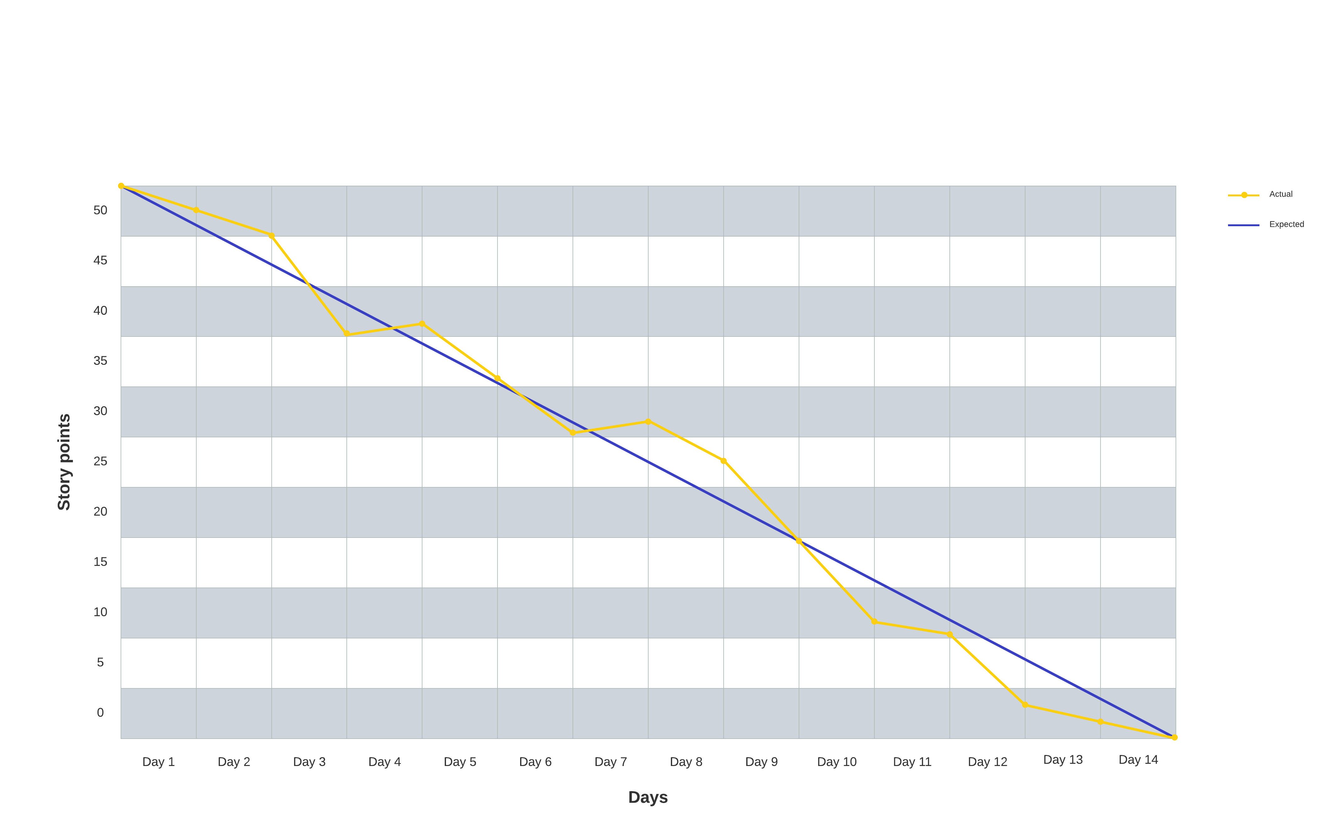
Ideally, the actual effort would line up with the ideal effort. In reality, some work will be marked below the ideal effort line (indicating that the team is ahead of schedule), and other work will be marked above the line (indicating that the team is behind schedule).
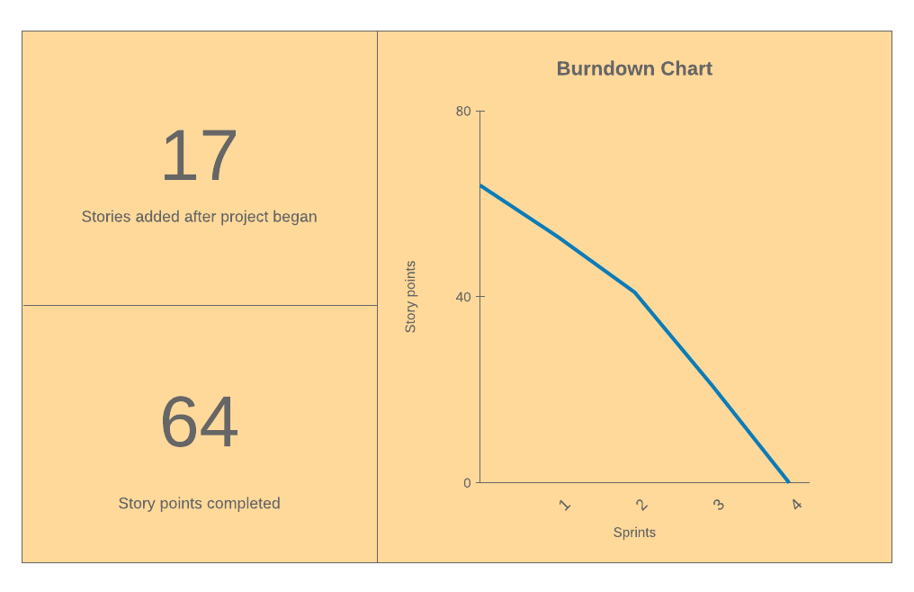
Here's an example of what a burndown chart might look like.
No matter what your sprint burndown chart ends up looking like, the important thing is that team members should be able to look at it and instantly see the progress and understand what still needs to be done to reach a goal.
Who creates and manages the sprint burndown chart?
Because Scrum is designed for smaller teams that are self-managing, all members of the team (developers, product owner, Scrum master) are responsible for creating and updating a Scrum burndown chart.
The developers are responsible for making the information transparent so that stakeholders can keep up to date on the project’s progress. Looking at the estimated work line against the actual work line, the product owner determines if the project is on schedule or behind schedule. If the project is too far behind schedule, the product owner may decide to update the release plan in order to get the project back on schedule. The Scrum master’s role is to support and coach the team to ensure that they work within the rules set by Agile and Scrum.
Advantages of using a burndown chart in Agile
- Creates a visual, easy-to-digest point of reference. People generally grasp and retain information better when it is presented visually—the sprint burndown chart should be large and placed prominently where everybody can refer to it as needed.
- Improves transparency. Displaying the chart where everybody can see it encourages teams to constantly evaluate performance and update estimates of work to be done.
- Reduces risk. Because the burndown chart gives the team daily feedback about the schedule, actual work, and estimated work, the team can respond to issues and quickly make adjustments before they become problems.
- Saves time. Tracking progress visually is faster and easier than looking through email and other documents to figure out the current status of the project. Plus, if you have linked your burndown chart to real-time data, it’s also simple to update.
Disadvantages of using a burndown chart in Agile
- Doesn’t tell the whole story. The burndown chart is somewhat limiting because it is hard to determine if changes are the result of story points being added or subtracted or due to backlog items being completed.
- Depends on accurate data. The actual effort line will never slope exactly along the ideal effort line. When the actual effort line falls below or above the ideal effort line, does it mean that the team is ahead or behind schedule? Or, does it mean that the team overestimated or underestimated the amount of work to be done?
- Overestimation. If the team regularly overestimates the time requirements, the team will always appear to be ahead of schedule, which could lead to exaggerated expectations.
- Does not reflect how close work is to being completed. The chart shows you current progress and remaining work, but it does not show you how close the team is to completing the work.
- Doesn’t account for backlog items. The burndown chart does not indicate which backlog items have been completed. While the chart does show that the team is making progress, it doesn’t show that progress is being made on the right tasks.
Sprint burndown charts provide Scrum teams with the information they need to be organized, self-managed, and motivated to reach a common goal. With Lucidchart, you can easily create these visuals from your data and even integrate them with popular Agile software like Jira to provide transparency and alignment across teams.

Find out how you can use Lucidchart to roll out the Agile methodology for your organization.
Learn moreAbout Lucidchart
Lucidchart, a cloud-based intelligent diagramming application, is a core component of Lucid Software's Visual Collaboration Suite. This intuitive, cloud-based solution empowers teams to collaborate in real-time to build flowcharts, mockups, UML diagrams, customer journey maps, and more. Lucidchart propels teams forward to build the future faster. Lucid is proud to serve top businesses around the world, including customers such as Google, GE, and NBC Universal, and 99% of the Fortune 500. Lucid partners with industry leaders, including Google, Atlassian, and Microsoft. Since its founding, Lucid has received numerous awards for its products, business, and workplace culture. For more information, visit lucidchart.com.
Related articles
How to manage Scrum teams in Lucidchart
At Lucid, we have been able to form Scrum teams of engineers, product managers, QA specialists, and UX designers using the org chart functionality in Lucidchart. Let me walk through the process so you can try it out at your own company.
How to Develop a Stellar Scrum Product Backlog
A scrum product backlog lists the items that are “on deck” for the development team—it helps you see what’s coming up so your team can plan and work quickly to release new features. Learn how to use this agile tool.
How to build a Scrum team structure for Agile development
As the pace of business continues to accelerate, more and more organizations are turning to agile frameworks, like the Scrum team structure, to keep up. Learn how can you build an effective Scrum team for agile development.
Is Scrum project management methodology a fit for my team?
Learn about the Scrum framework—including benefits, roles, and events—and discover whether it’s the perfect project management solution for your team.
Bring your bright ideas to life.


By registering, you agree to our Terms of Service and you acknowledge that you have read and understand our Privacy Policy.