How to create a sales dashboard

Reading time: about 7 min

Topics:

  • Sales

Driving revenue for organizations often falls on the sales team. That’s a lot of pressure, and there are so many moving parts that contribute to each sale, it’s difficult to figure out what parts of the process are working and what needs to be fixed. It’s also difficult to motivate a sales team without being able to quantify their successes and missed opportunities. 

Thankfully, with the help of a sales dashboard, you and your sales team can be better equipped to make important decisions and gain a high-level view of all the contributing KPIs that comprise your sales funnel.

What is a sales dashboard?

A sales dashboard is similar to the dashboard of your car: It shows you all the necessary data to get your sales team moving. Sales leaders use sales dashboards to get an instant visual understanding of their chosen sales stats and also craft strategies for improving sales. Sales reps are often are given access to the sales dashboard, which helps them know where to focus their efforts for greater results and gain insights that wouldn’t be understood without a visual presentation.

It’s important to note that all sales dashboards are customized. Sales leaders will select which metrics are displayed on the sales dashboard, and those metrics can be used to guide the team through its sales strategy.

A sales leaderboard is one type of dashboard for sales. A sales leaderboard displays side-by-side comparisons of individual sales performances. Sales leaderboards often show metrics like:

  • Win rate.
  • Current sales contest.
  • Team quota attainment for the quarter.
  • Closed business by type.
  • Top deals.

However, sales dashboards can do much more than just track performance. Sales dashboards are an important tool for building a stronger sales team and crafting a smarter sales strategy. They show you areas of weakness and can help motivate, inspire, and inform.

How to determine your most important KPIs

As stated previously, your sales dashboard is customized to your needs, which means you’ll need to select the most important sales KPIs for your team. 

Thankfully, you won’t have to generate these sales metrics by hand (insert sigh of relief here) because your CRM should do that for you, but you will need to select which KPIs to display on your dashboard. 

To identify the most important metrics, you’ll first need to decide what you want your team to focus on most. For instance, if lead quality is lacking, then you may want to focus on generating higher-quality leads and implementing a pipeline value metric. If you want to know how well marketing is helping your sales team, it may be worth having the MQL-to-SQL conversion rate on your dashboard.

Common sales metrics include:

  • Sales growth.
  • Sales target.
  • Opportunities.
  • Sales to date.
  • Sales per rep.
  • Sales by region.
  • Average purchase value.
  • Product performance.
  • Lead conversion rate.
  • Sell-through rate.
  • Cannibalization rate.
  • Quote-to-close.

You should have a mix of results-based metrics, which detail performance and outcomes like sales to date, and activity-based metrics, which detail the amount of work being performed, such as how many proposals have been made, how many calls have been made, etc.

Not sure where to begin? See our list of the 13 most important KPIs for sales success.

Learn more

Once you have determined your most important KPIs, It’s time to figure out where that data is stored so you can pull it into a dashboard. Most likely, it’s all going through your CRM, but you’ll probably need to meet with other teams to figure out which tools are collecting information.

How to create a sales dashboard in Lucidchart

In Lucidchart, you can import and visualize data from various sources to give your sales org a clear picture of where your reps are at and how they can improve. Follow these five fundamental steps to start your sales dashboard.

  1. Identify the KPIs you want to cover and their data sources.
  2. Start with a dashboard template or, alternatively, open a blank document and determine the best way to visualize the data you want to track.
  3. Use data linking or the Zapier integration to pull data from your data services into Lucidchart.
  4. Add conditional formatting to automatically adjust shapes based on performance.
  5. Share your dashboard with others or integrate it into the apps you use daily.

For inspiration, take a look at these sales dashboard examples.

KPI and sales activity dashboard
KPI and sales activity dashboard (click on image to modify online)
sales leaderboard dashboard
Sales leaderboard dashboard (click on image to modify online)

And for more information on data linking and dynamic shapes, watch the video below or see our complete step-by-step tutorial on how to make a dashboard in Lucidchart.

Hot tips for designing a dashboard for sales

Hopefully, our sales dashboard example will motivate you to try your hand at your own sales dashboard design. But before you get going, here are a few more tips.

1. Define your terms and stick to them

There’s so much jargon in sales that it can confuse even the most savvy of salespeople. Even a term like “goals” can mean something different to each person. If by “goals,” you mean monetary sales goals, then that term should remain consistent throughout your dashboard and sales documents. Consistency will ensure clarity when viewing and interpreting the data on your sales dashboard.

2. Keep it simple

It’s tempting to want to cram every metric onto your dashboard. But in this case, less is more. Nothing is gained by making a dashboard so overwhelming that no one wants to spend time trying to decipher the numbers. Keep it simple and keep it powerful.

3. Think audience first

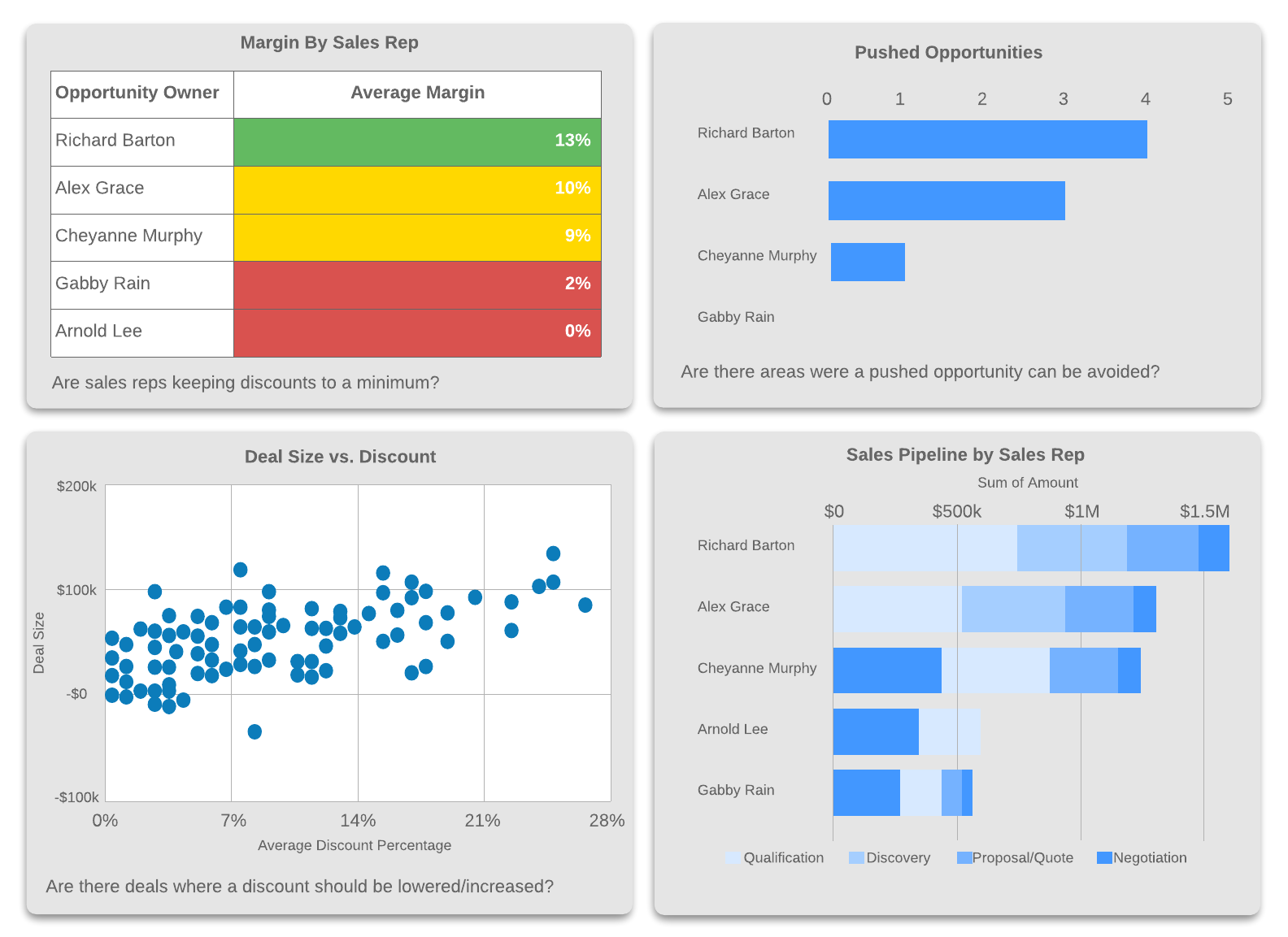
If your sales dashboard will only be seen by your sales team, you probably don’t want any metrics that have to do with website productivity or how successful your organization’s marketing efforts areno matter how interesting that data might be. Keep the dashboard focused on what matters to your sales team most.

4. Simplify large numbers

No one wants to see $20,748,345.23. Instead, say $20 million or almost $21 million. Simplified numbers are easier to digest at a glance and easier to work with when putting them in context. (They’re also nicer to look at on a sales dashboard and help prevent visual clutter). 

5. Choose pleasing colors

You may have a reaction to this: After all, you’re in sales, not in design. But color has a genuine effect on your choices. After all, would you buy a pea-green Ferrari or a hot red one? Similarly, the colors you choose may affect how receptive people are to your sales dashboard and how often they consult it.

When in doubt, stick to your company’s brand colors, as they were likely chosen by a designer. It’s important to make your dashboard accessible so that those with visual and other impairments can use it. Use highly contrasting colors, and large text, and make sure images have alt text. (If you need help creating alt text descriptions, try out the AltText.ai and Lucidchart integration to automatically generate alt text for you.)

How to use a sales dashboard for motivation

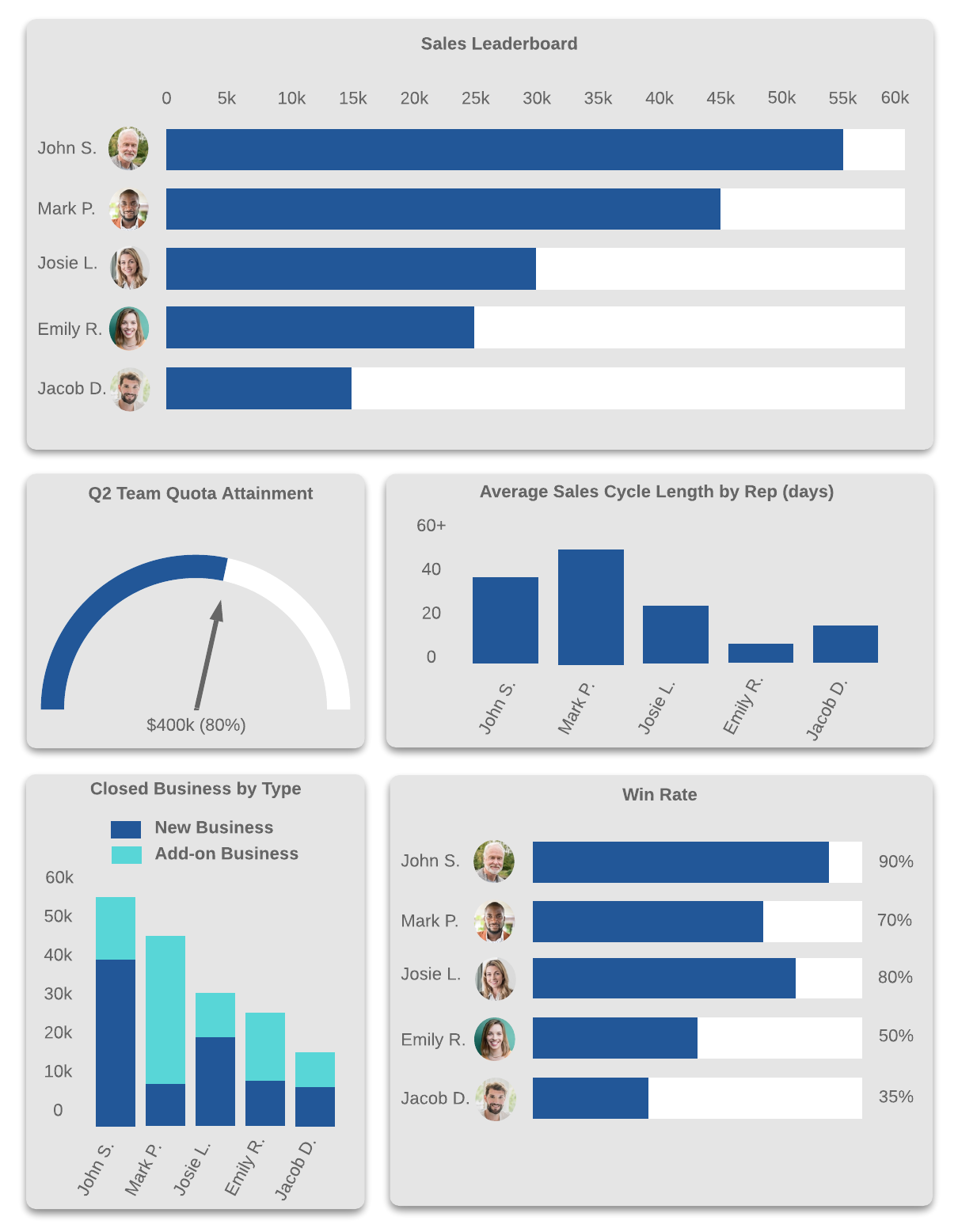
We mentioned earlier that a sales leaderboard is a type of sales dashboard. The sales leaderboard is great for motivating your sales team. It can display monthly sales, quarterly sales, weekly sales, and more competitive metrics. Consider these ways to use a sales dashboard to motivate your team:

  1. Encourage healthy competition: The sales profession attracts competitive people, so a sales dashboard can capitalize on that by encouraging your sales reps to compete for the top. Celebrate wins in company-wide updates and recognize your reps’ accomplishments. You could also hold contests, rewarding top sales reps with gift cards, extra time off, or entries into a raffle.
  2. Set goals: Set personal goals with your reps and use the sales dashboard to help them track those goals.
  3. Promote transparency: Share your leaderboard beyond your team. Your entire organization should be participating in sales, not just the sales team. So be open about what’s happening in the sales department—it’s great for motivating the entire company and promoting a culture of transparency.

Sales dashboards are truly invaluable resources for sales managers and sales teams. Use them to better understand your whole sales environment, from how well your marketing efforts are paying off to which leads are due to generate the highest sales. 

With this high-level view, you can better strategize and identify bottlenecks and other potential problems before they undermine your sales efforts. Plus, by using a sales leaderboard, you can motivate your team and help them have an eye toward the future.

TUTORIAL

Now it's time to try it out! Learn how Lucidchart can help you create a dynamic, shareable dashboard.

Learn more

Lucidchart

Lucidchart, a cloud-based intelligent diagramming application, is a core component of Lucid Software's Visual Collaboration Suite. This intuitive, cloud-based solution empowers teams to collaborate in real-time to build flowcharts, mockups, UML diagrams, customer journey maps, and more. Lucidchart propels teams forward to build the future faster. Lucid is proud to serve top businesses around the world, including customers such as Google, GE, and NBC Universal, and 99% of the Fortune 500. Lucid partners with industry leaders, including Google, Atlassian, and Microsoft. Since its founding, Lucid has received numerous awards for its products, business, and workplace culture. For more information, visit lucidchart.com.

Related articles

Bring your bright ideas to life.

Sign up free

or continue with

Sign in with GoogleSign inSign in with MicrosoftSign inSign in with SlackSign in

Get started

  • Pricing
  • Individual
  • Team
  • Enterprise
  • Contact sales
PrivacyLegal

© 2024 Lucid Software Inc.