History of the DFD
Data flow diagrams were popularized in the late 1970s, arising from the book Structured Design, by computing pioneers Ed Yourdon and Larry Constantine. They based it on the “data flow graph” computation models by David Martin and Gerald Estrin. The structured design concept took off in the software engineering field, and the DFD method took off with it. It became more popular in business circles, as it was applied to business analysis, then in academic circles.
Also contributing were two related concepts:
- Object Oriented Analysis and Design (OOAD), put forth by Yourdon and Peter Coad to analyze and design an application or system.
- Structured Systems Analysis and Design Method (SSADM), a waterfall method to analyze and design information systems. This rigorous documentation approach contrasts with modern agile approaches such as Scrum and Dynamic Systems Development Method (DSDM.)
Three other experts contributing to this rise in DFD methodology were Tom DeMarco, Chris Gane and Trish Sarson. They teamed up in different combinations to define the symbols and notations used for a data flow diagram.
Symbols and Notations Used in DFDs
Two common systems of symbols are named after their creators:
- Yourdon and Coad
- Yourdon and DeMarco
- Gane and Sarson
One main difference in their symbols is that Yourdon-Coad and Yourdon-DeMarco use circles for processes, while Gane and Sarson use rectangles with rounded corners, sometimes called lozenges. There are other symbol variations in use as well, so the important thing to keep in mind is to be clear and consistent in the shapes and notations you use to communicate and collaborate with others.
Using any convention’s DFD rules or guidelines, the symbols depict the four components of data flow diagrams.
- External entity: an outside system that sends or receives data, communicating with the system being diagrammed. They are the sources and destinations of information entering or leaving the system. They might be an outside organization or person, a computer system or a business system. They are also known as terminators, sources and sinks or actors. They are typically drawn on the edges of the diagram.
- Process: any process that changes the data, producing an output. It might perform computations, or sort data based on logic, or direct the data flow based on business rules. A short label is used to describe the process, such as “Submit payment.”
- Data store: files or repositories that hold information for later use, such as a database table or a membership form. Each data store receives a simple label, such as “Orders.”
- Data flow: the route that data takes between the external entities, processes and data stores. It portrays the interface between the other components and is shown with arrows, typically labeled with a short data name, like “Billing details.”
Want more detail? Here is a comprehensive look at diagram symbols and notations and how they’re used.
DFD rules and tips
- Each process should have at least one input and an output.
- Each data store should have at least one data flow in and one data flow out.
- Data stored in a system must go through a process.
- All processes in a DFD go to another process or a data store.
DFD levels and layers: From context diagrams to pseudocode
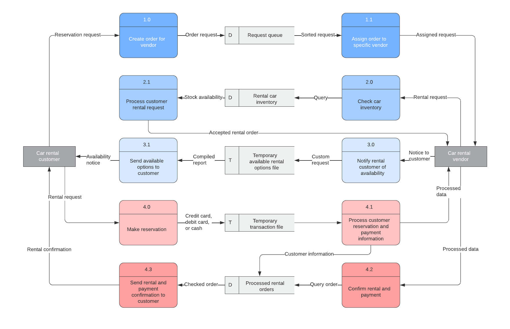
A data flow diagram can dive into progressively more detail by using levels and layers, zeroing in on a particular piece. DFD levels are numbered 0, 1 or 2, and occasionally go to even Level 3 or beyond. The necessary level of detail depends on the scope of what you are trying to accomplish.
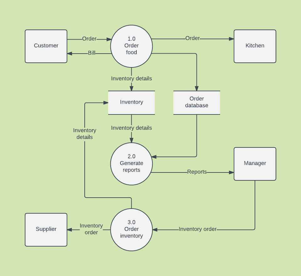
- DFD Level 0 is also called a Context Diagram. It’s a basic overview of the whole system or process being analyzed or modeled. It’s designed to be an at-a-glance view, showing the system as a single high-level process, with its relationship to external entities. It should be easily understood by a wide audience, including stakeholders, business analysts, data analysts and developers.

- DFD Level 1 provides a more detailed breakout of pieces of the Context Level Diagram. You will highlight the main functions carried out by the system, as you break down the high-level process of the Context Diagram into its subprocesses.

- DFD Level 2 then goes one step deeper into parts of Level 1. It may require more text to reach the necessary level of detail about the system’s functioning.

- Progression to Levels 3, 4 and beyond is possible, but going beyond Level 3 is uncommon. Doing so can create complexity that makes it difficult to communicate, compare or model effectively.
Using DFD layers, the cascading levels can be nested directly in the diagram, providing a cleaner look with easy access to the deeper dive.
By becoming sufficiently detailed in the DFD, developers and designers can use it to write pseudocode, which is a combination of English and the coding language. Pseudocode facilitates the development of the actual code.
Examples of how DFDs can be used
Data flow diagrams are well suited for analysis or modeling of various types of systems in different fields.
DFD in software engineering: This is where data flow diagrams got their main start in the 1970s. DFDs can provide a focused approached to technical development, in which more research is done up front to get to coding.
DFD in business analysis: Business analysts use DFDs to analyze existing systems and find inefficiencies. Diagramming the process can uncover steps that might otherwise be missed or not fully understood.
DFD in business process re-engineering: DFDs can be used to model a better, more efficient flow of data through a business process. BPR was pioneered in the 1990s to help organizations cut operational costs, improve customer service and better compete in the market.
DFD in agile development: DFDs can be used to visualize and understand business and technical requirements and plan the next steps. They can be a simple yet powerful tool for communication and collaboration to focus rapid development.
DFD in system structures: Any system or process can be analyzed in progressive detail to improve it, on both a technical and non-technical basis.
[Model a system in your field of work. Get started]
DFD vs. Unified Modeling Language (UML)
While a DFD illustrates how data flows through a system, UML is a modeling language used in Object Oriented Software Design to provide a more detailed view. A DFD may still provide a good starting point, but when actually developing the system, developers may turn to UML diagrams such as class diagrams and structure diagrams to achieve the required specificity.
Logical DFD vs. Physical DFD
These are the two categories of a data flow diagram.
A Logical DFD visualizes the data flow that is essential for a business to operate. It focuses on the business and the information needed, not on how the system works or is proposed to work.
However, a Physical DFD shows how the system is actually implemented now, or how it will be. For example, in a Logical DFD, the processes would be business activities, while in a Physical DFD, the processes would be programs and manual procedures.
Want to know more? See our deeper look into Logical DFDs vs. Physical DFDs.
How to make a data flow diagram
To create your own DFD in Lucidchart, Use our DFD examples and specialized notations to visually represent the flow of data through your system. Take a look at this DFD tutorial for a step-by-step guide.
Our data flow diagram maker is simple, yet powerful. Get started with a template, and then use our shapes to customize your processes, data stores, data flows and external entities. Happy diagramming!