Any given project can have a lot of stakeholders, including senior and executive management, employees, stockholders, customers, and so on. These stakeholders are interested in your project, its current status, features and functions, and how it works.
The success or failure of your project might depend on your ability to explain to your stakeholders what the technology in question is, how it is developed and used, and why it will benefit them. It’s important that you get this information right, that you don’t gloss over problem areas, and that the expected outcomes are clear. And if you get buy-in on the project, you’ll have to keep your stakeholders educated, engaged, and up to date on project status.
This might not be as easy as it sounds, especially when you are working with people who have varying degrees of technical knowledge.
So, how do you explain technical concepts to a non-technical audience?
In this article, we will review seven tips that developers, engineers, IT workers, and other technical professionals can use to communicate their ideas more effectively. These can quickly be put into practice in almost any workplace imaginable.
Let’s get started.
1. Know your audience
Before you take any kind of approach, you should think about who your audience is. As you get to know your stakeholders, you’ll get a sense of where they have areas of expertise and the level of their technical knowledge. This way, you won’t waste time explaining stuff they already know or that doesn’t pertain to their role. Is your audience non-techies? Is it a mix of non-technial personnel and fellow technical professionals skilled in other disciplines?
In an audience with different levels of expertise, it’s a balancing act to find the right level of information that is not too simple for more technical team members and is not too complex for those who are less technical. You’ll want to be thoughtful. It’s best to not give the impression that you are oversimplifying for specific members of your audience.
2. Be attentive to your audience throughout your presentation
Going along with knowing your audience, as you present, be observant of body language and the overall tone of the room. You’ll quickly learn when it’s time to move on and when you need to spend more time on certain information
Whenever you share your technical know-how with a non-technical audience, the goal is to be conversational. Even if you’ve explained the technology dozens of times and know the subject matter inside and out, the people you’re currently talking to might be hearing about it for the first time. Always present with enthusiasm.
3. Incorporate storytelling when sharing technical information
When you have a lot of data or information to share, take time to allow your audience to wrap their heads around your subject, avoiding the urge to cram every detail on a slide and just reading it aloud.
If you’re going to use a slide deck to convey your information, remember that every slide should enhance the presentation and not detract from it. Don’t use boring stock photos or charts that fail to express your message clearly and quickly. Think of each slide in the context of how it will guide your audience along the journey from point A to point B.
As you put together your presentation, always keep your objective or purpose in mind.
To start, what’s the most important takeaway? Are you trying to convince your CMO that no-code platforms for citizen developers will dramatically reduce the product backlog? Or maybe you’re hoping to convince finance that your tech team deserves new equipment? Whatever the situation, storytelling is more persuasive than facts alone.
Stories are effective at planting ideas in the minds of your audience—especially stories told from personal experience. If you don’t have your own relatable or relevant story, use anecdotes taken from recent events or industry publications that fit your needs.
4. Use visuals to explain technical information and processes
Written content and verbal explanations are both essential ways to communicate ideas.
However, when your goal is to simplify technical information, visualizing your concepts can be a much more effective communication medium. Why? Visual content is easier to learn and more frequently recalled than concepts learned by reading or just being told. This phenomenon is called the picture superiority effect. Research suggests a visual can improve one's ability to synthesize information by 36%.
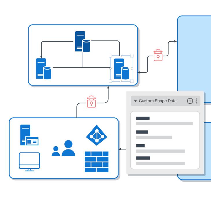
Not surprisingly, many people make regular use of diagrams, models, and other visual presentation techniques to get their point across. If you’re looking for a quick, effective way to visualize and share your content with your organization, there’s Lucidchart.
With its user-friendly templates and interface, you can easily adapt or edit your process workflows to the demands of your non-technical audience. For example, an executive doesn’t necessarily need to review every part of a data flow diagram. They may just want a basic understanding of the structure. With Lucidchart, you can create easy-to-digest diagrams and visuals to share wth stakeholders. Plus, Lucidchart includes Presentation Mode, so you can present the visuals you’ve already put together in Lucidchart without having to transfer anything to a slide deck.
Bonus tip: Lucid Enterprise accounts come with universal canvas, a capability that allows you to seamlessly switch between Lucidchart for diagramming and Lucidspark for whiteboarding. It’s perfect for technical and non-technical teams working together!