Advantages of PERT charts vs. Gantt charts
Reading time: about 6 min
About Lucidchart
Lucidchart, a cloud-based intelligent diagramming application, is a core component of Lucid Software's Visual Collaboration Suite. This intuitive, cloud-based solution empowers teams to collaborate in real-time to build flowcharts, mockups, UML diagrams, customer journey maps, and more. Lucidchart propels teams forward to build the future faster. Lucid is proud to serve top businesses around the world, including customers such as Google, GE, and NBC Universal, and 99% of the Fortune 500. Lucid partners with industry leaders, including Google, Atlassian, and Microsoft. Since its founding, Lucid has received numerous awards for its products, business, and workplace culture. For more information, visit lucidchart.com.
Related articles
Identifying and managing project constraints
This article discusses some of the constraints you might encounter and what you can do to work around them to keep your project on track.
How to Make a Gantt Chart in Excel
Learn two approaches on how to make a Gantt chart in Excel with this complete step-by-step guide. Free templates included!
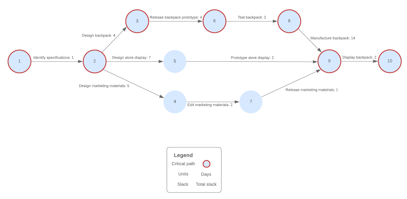
Advantages of PERT charts vs. Gantt charts
What's the difference between a PERT chart and a Gantt chart? Both of these tools can improve your project management processes. Learn when to use PERT and Gantt charts and how to create them.
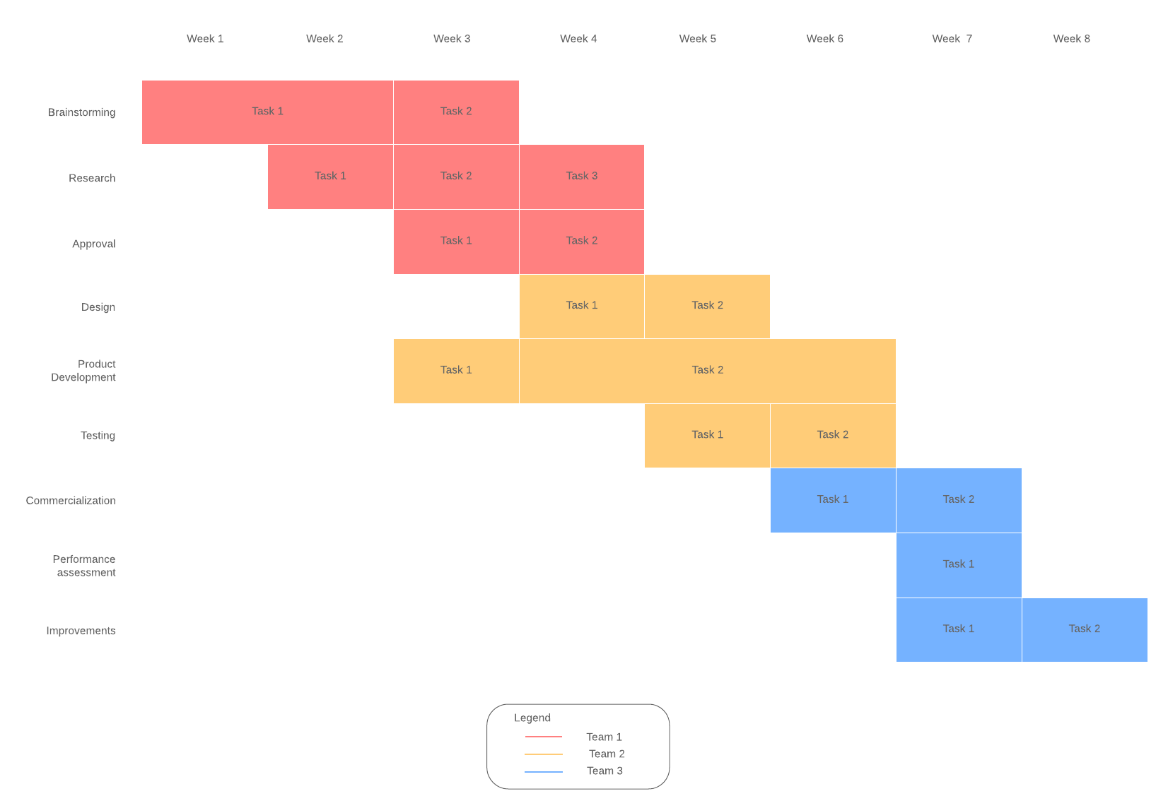
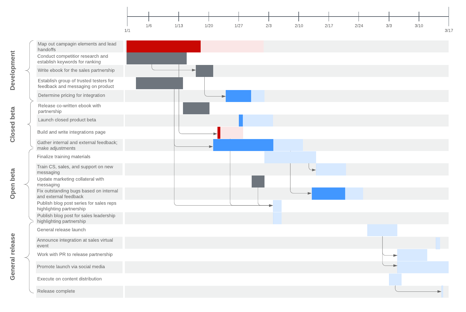
How to use a Gantt chart
Gantt charts visualize an entire project from start to finish, making it easy to track progress, improve efficiency, and clearly communicate with the project team.
Bring your bright ideas to life.


By registering, you agree to our Terms of Service and you acknowledge that you have read and understand our Privacy Policy.