Six Sigma tools you need to improve your processes
Lucid Content
Reading time: about 9 min
Topics:
As one of the world’s foremost process improvement and project management methodologies, Six Sigma has helped the likes of Amazon and GE develop efficient processes, maintain quality, and stay relevant in an ever-changing business landscape. Regardless of your industry, applying the Six Sigma methodology to your organization or project can help you increase efficiency and reduce waste to produce the best possible product.
Whether you’ve yet to implement the Six Sigma methodology or you’re looking for new ways to incorporate its philosophy into your project management style, we’ve come up with the ultimate list of Six Sigma tools that can be easily applied to any project or organization.
Each tool can be used in conjunction with one of Six Sigma’s approaches to process improvement:
Prioritization tools
Root cause analysis tools
Process improvement tools
Performance measurement tools
Quality tools
Tools for prioritizing work
The first step to applying Six Sigma’s DMAIC methodology to any project is defining the meaningful and workable needs of your customer. Once needs have been established, use prioritization tools to determine which needs require more immediate attention.
Your team can base prioritization on availability of resources, customer pain points, and other criteria using the following tools.
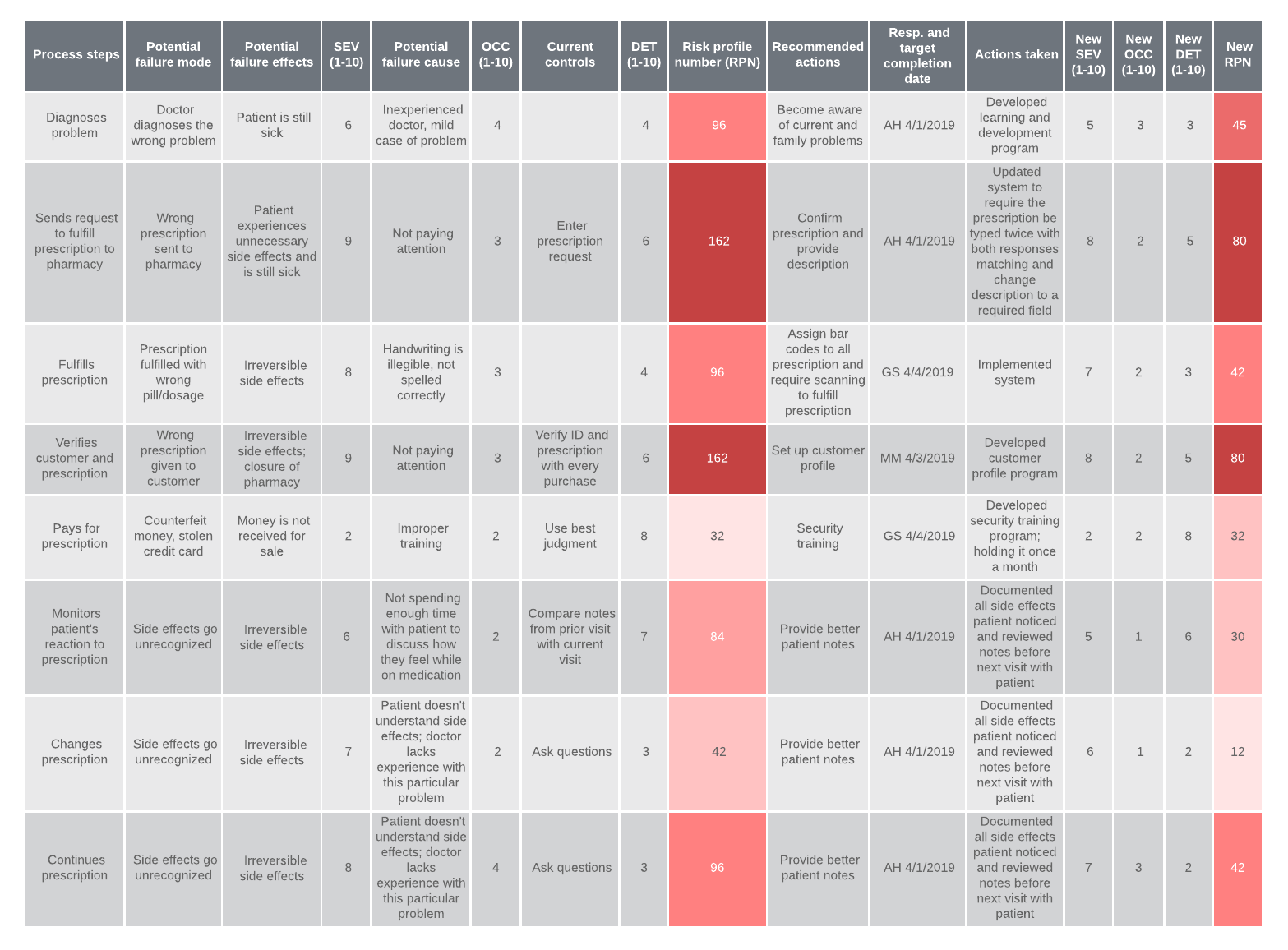
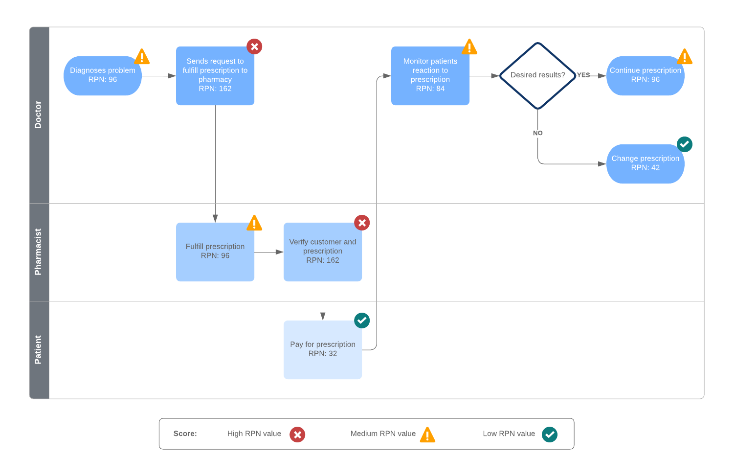
Failure Modes and Effects analysis (FMEA)
An FMEA lets you identify and strategize against a project’s biggest risks. Applied early in the planning process, FMEA asks what could fail, how likely it is to fail, and what consequences might result from this failure. With a project’s possible downfalls in mind, you can more effectively safeguard your processes against potential risks.
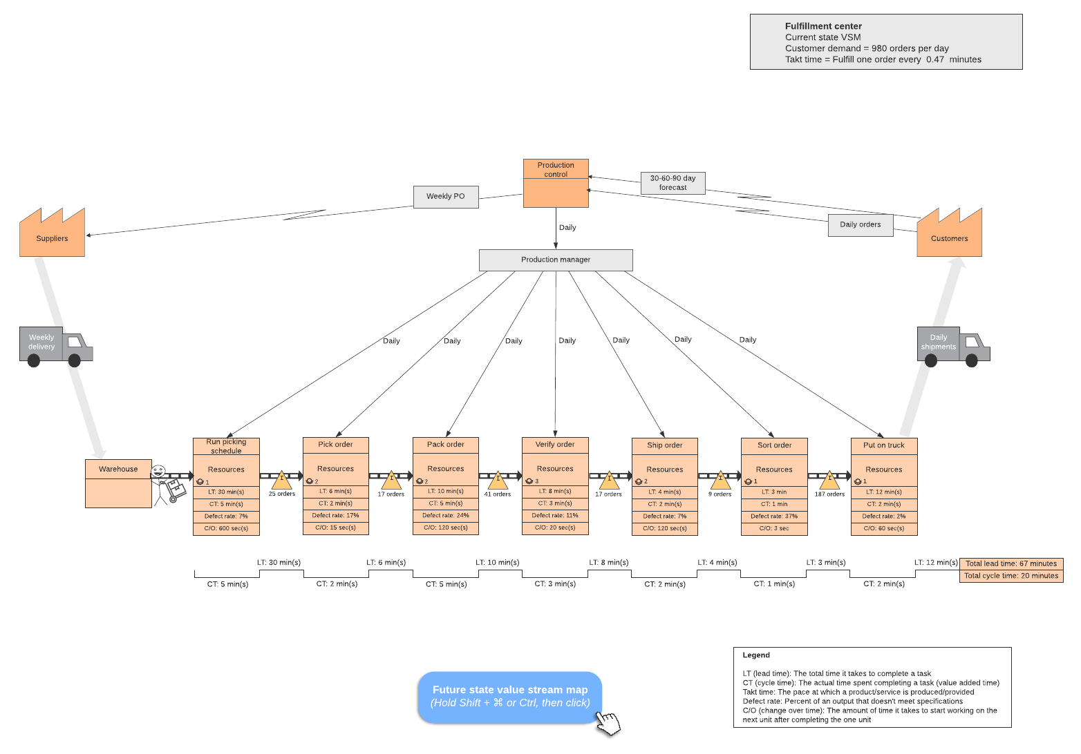
Value stream map
A value stream map illustrates the individual steps involved in creating your product or service so you can identify and reduce unnecessary waste within your process. Your value stream analysis will pinpoint problem areas that demand further attention, allowing you to create a leaner, more efficient response to your customer’s needs.
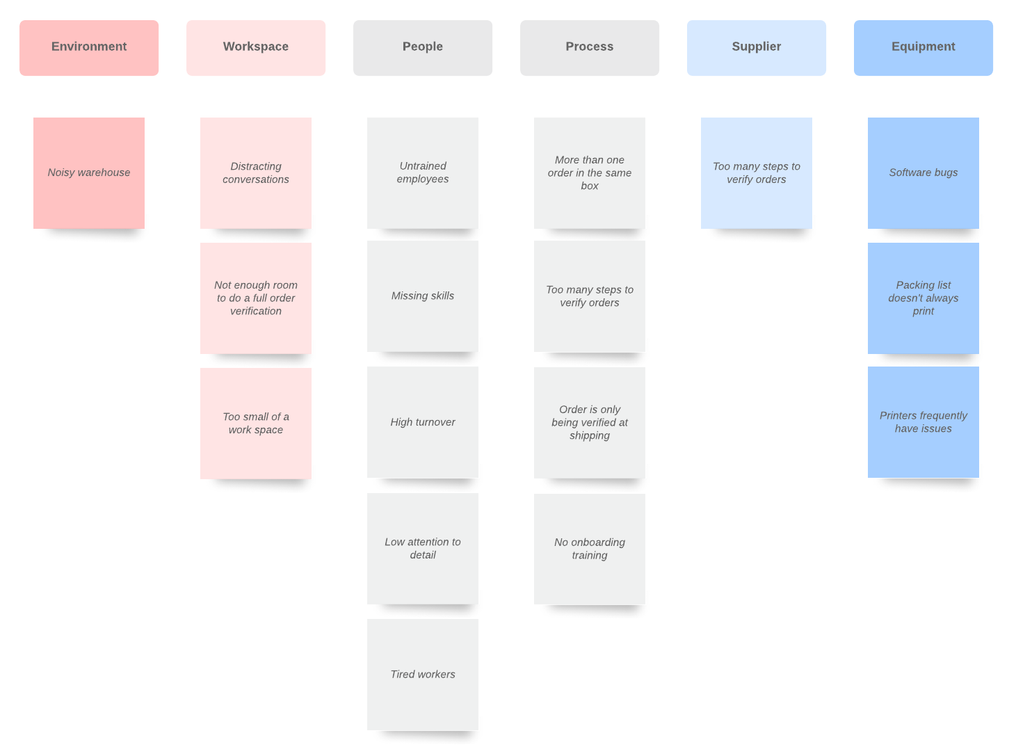
Affinity diagram
Ideal for generating and sorting ideas, affinity maps can be used to easily prioritize needs as you begin the project planning process. Conduct an affinity analysis with stakeholders to identify needs, group them together based on priority, and brainstorm possible solutions.
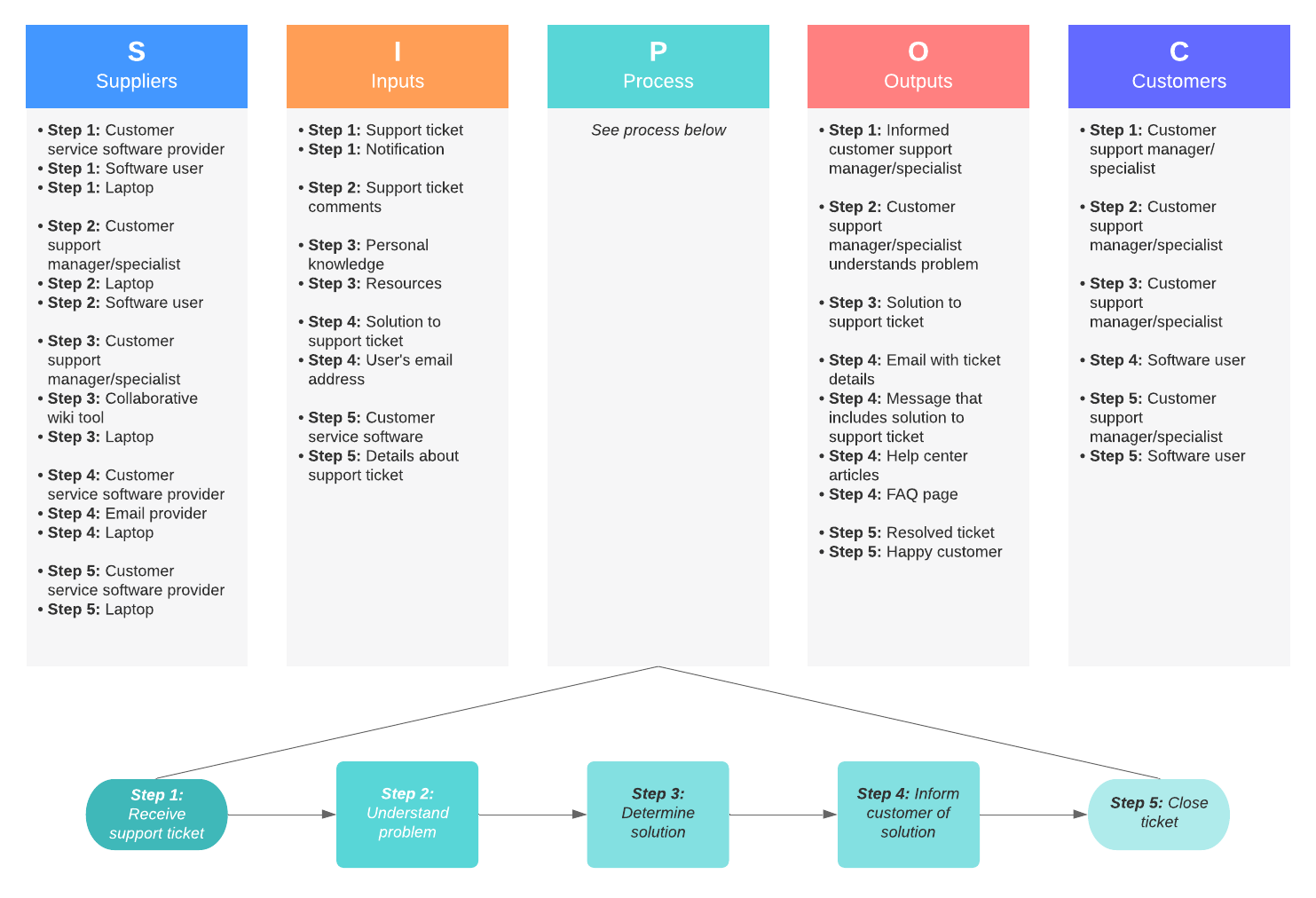
SIPOC diagram (Supplies, Inputs, Process, Outputs, and Customers)
As its name suggests, a SIPOC diagram asks teams to define the supplies, inputs, processes, outputs, and customers within a project. Acting as a high-level overview of a process, these visuals can act as a first step in creating a process map and answer important questions concerning who your customers are and what they need from your end product.
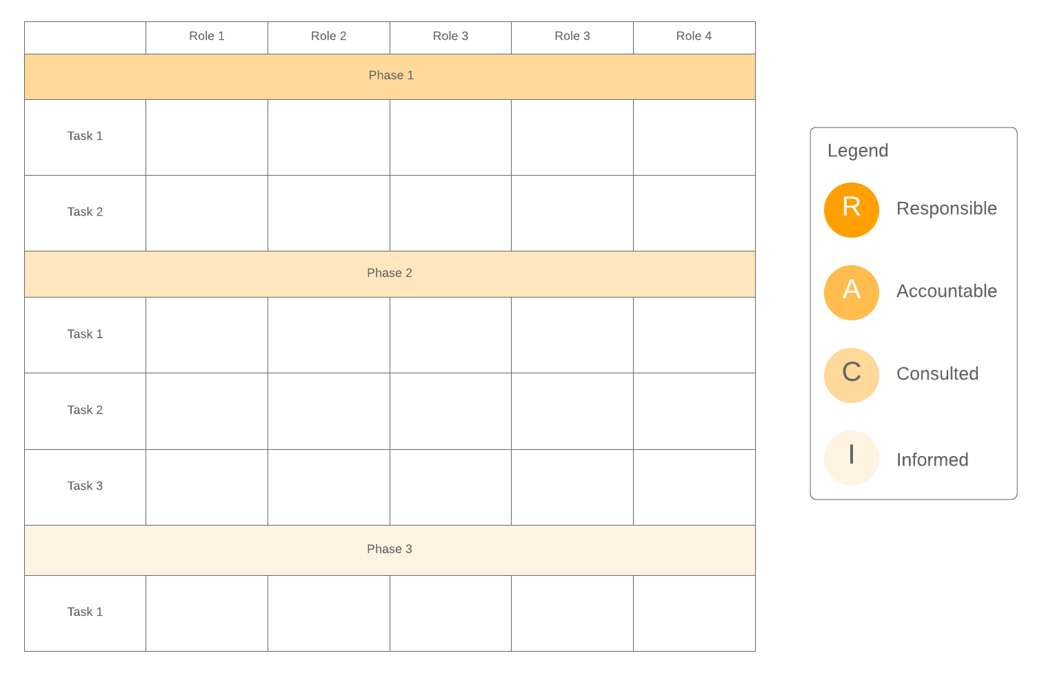
RACI chart (Responsible, Accountable, Consulted, Informed)
Eliminate confusion within your project by clearly documenting each task and who’s responsible for it. A RACI chart assigns roles and responsibilities within a project, defining who is responsible, accountable, consulted, and informed regarding individual tasks and decisions. With a RACI chart, you can ensure that your workload is distributed evenly and avoid delays resulting from confusion or lack of task ownership.
Tools for analyzing root causes
Root cause analysis is used to help management effectively prevent problems rather than continuously solve them. By identifying a problem’s causes and effects, project managers can implement permanent solutions to recurring issues. Use the following root cause analysis tools to help you define, analyze, and eliminate inefficiencies and bottlenecks within any process.
Regression analysis
A regression analysis can mathematically determine whether there is a relationship between your problem and a possible cause. The stronger the relationship between the two variables, the more certain you can be that you’ve identified one of the root causes of your problem. A regression analysis can also be used to forecast future relationships between variables, letting you prevent issues before they happen.
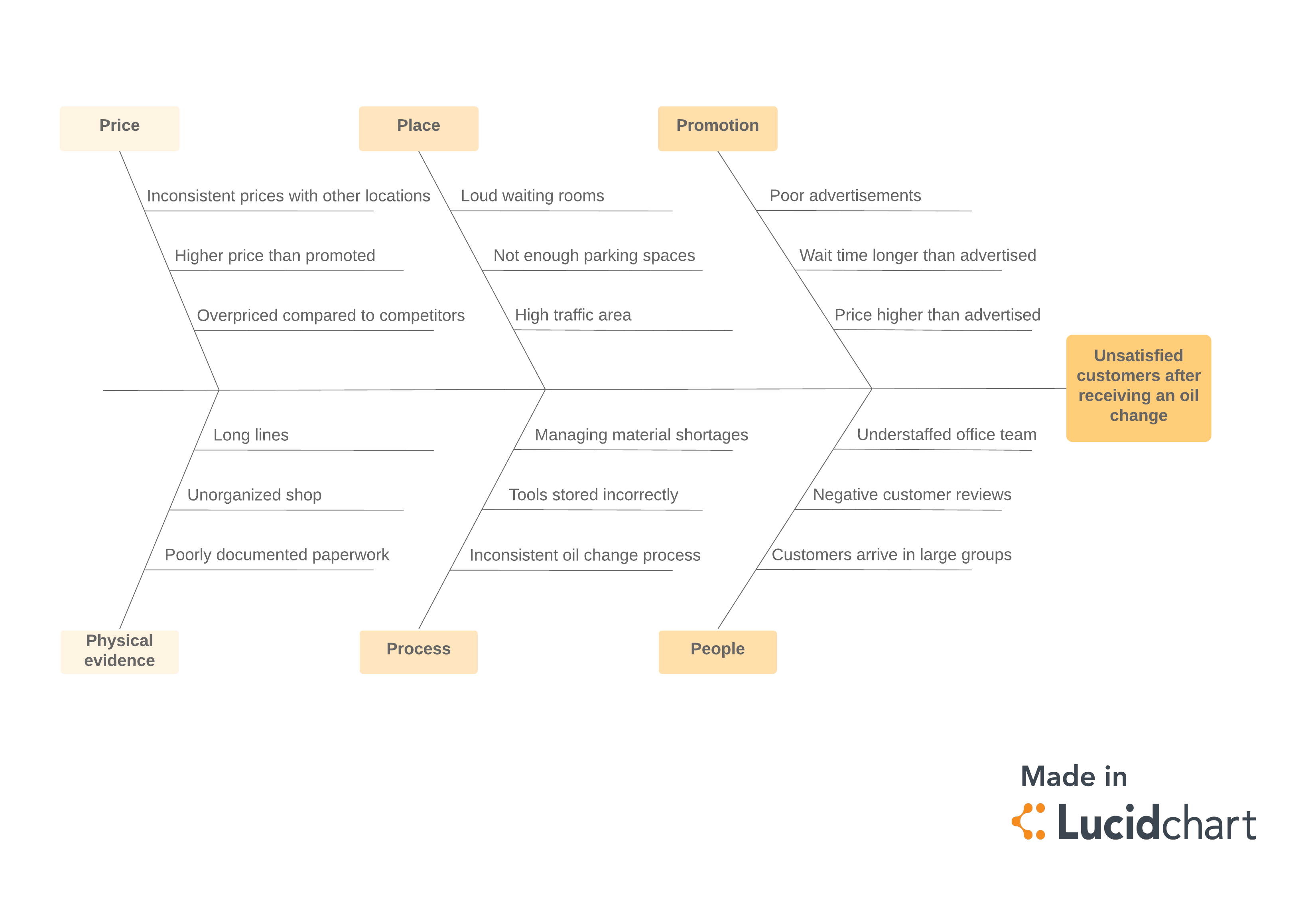
Fishbone diagram
The fishbone diagram (Ishikawa diagram) is a cause-and-effect diagram that provides a visual representation of each of a problem’s potential root causes. It’s particularly helpful when brainstorming causes and effects in group settings. With every possible root cause thoroughly explored, your team can put robust solutions in place.
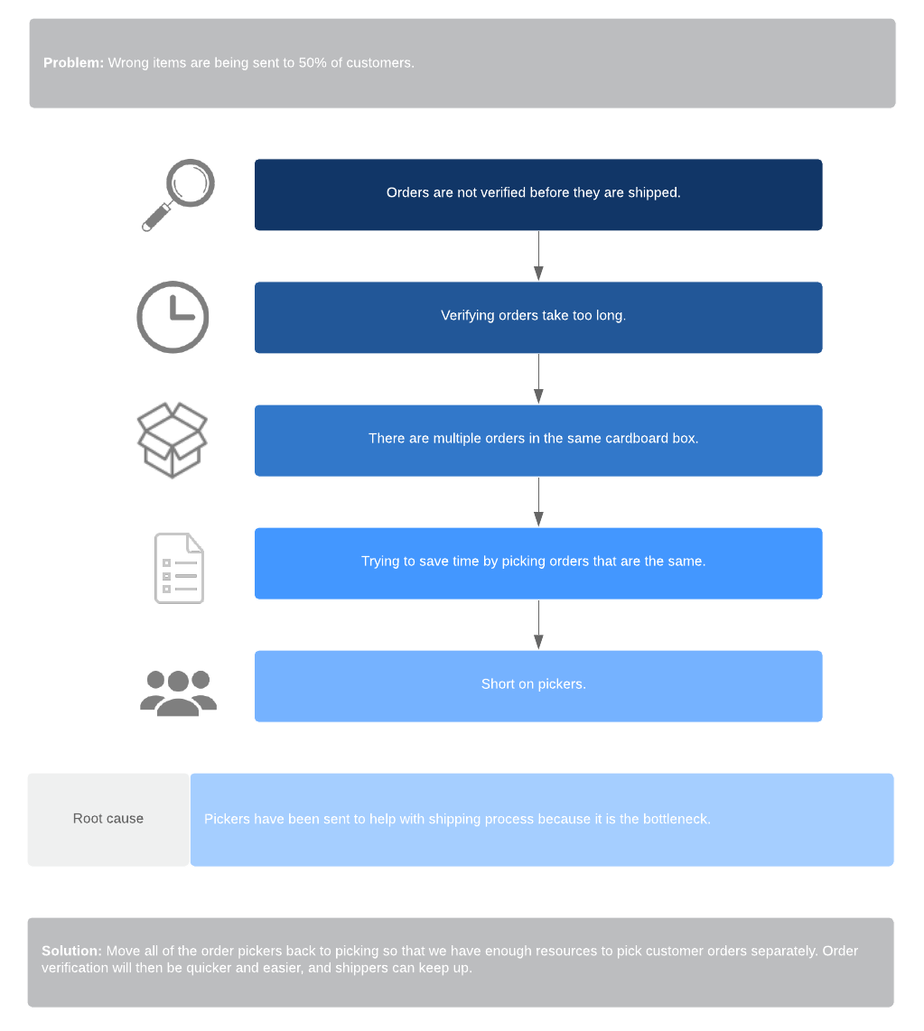
5 Whys
Closely related to the fishbone diagram, a 5 Whys analysis operates on the theory that one can identify the root of any problem by asking “Why?” five times. By the fifth “why,” inefficient management practices can usually be identified. The goal is to delve deeper into possible causes, even once they’ve been identified, to ensure the root of the cause is discovered.
Pareto chart
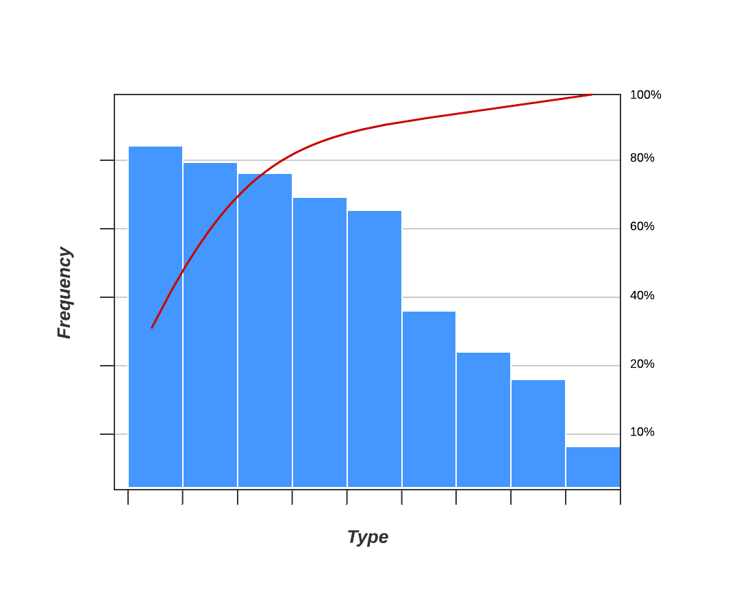
The Pareto Principle dictates that 80% of an organization’s projects are the result of 20% of its projects. Simply define your problem and potential causes, and then gather data relating to the cause’s frequency or cost. With a Pareto analysis, your team can easily prioritize a smaller number of significant cases in order to solve a majority of problems.
Tools for implementing improvements
Knowing what problems need to be addressed within your process is one thing—knowing how to address them is another. The process of implementing process improvements within your team is a marathon, not a sprint, and requires careful planning and communication. Below, you’ll find process improvement tools designed to help you make sustainable, long-term improvements that will help your team become more proactive and less reactive throughout each phase of your process.
Kaizen
“Kaizen,” the Japanese word for “continual improvement,” is a Lean manufacturing tool with five foundational elements: teamwork, personal discipline, improved morale, quality circles, and suggestions for improvement. When Kaizen is used in conjunction with the Kanban method, which offers a similar focus on continuous incremental changes, organizations can improve their processes steadily over time.
5S method
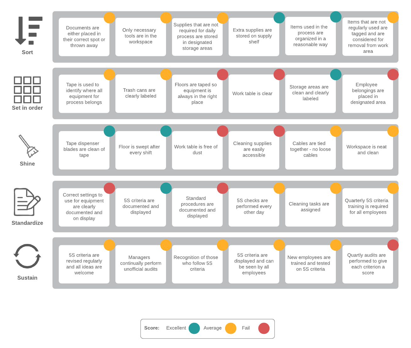
The 5S methodology is equally applicable to workplace management, manufacturing, and service settings and focuses on improved control throughout the workplace. The five S’s (roughly) stand for sort, set in order, shine, standardize, and sustain. By applying these five steps, your team can build an understanding about efficiency and organization, preventing defects and increasing productivity.
Poka-yoke (mistake proofing)
The purpose of error proofing is to prevent human error by drawing attention to where potential human errors can occur. In Lean methodology, a poka-yoke should be applied to any point in a manufacturing or service process where an error is most likely to occur (which can be identified using any of the root cause analysis tools above).
System diagram
A system diagram, or context diagram, is a flowchart-like visualization of the inputs, outputs, interactions, and boundaries within a system. An accurate systems diagram can help teams evolve from the reactive management of events to a more proactive management of entire systems. These diagrams can also identify misplaced energy and superfluous steps within a process for a more efficient system.
A3 report
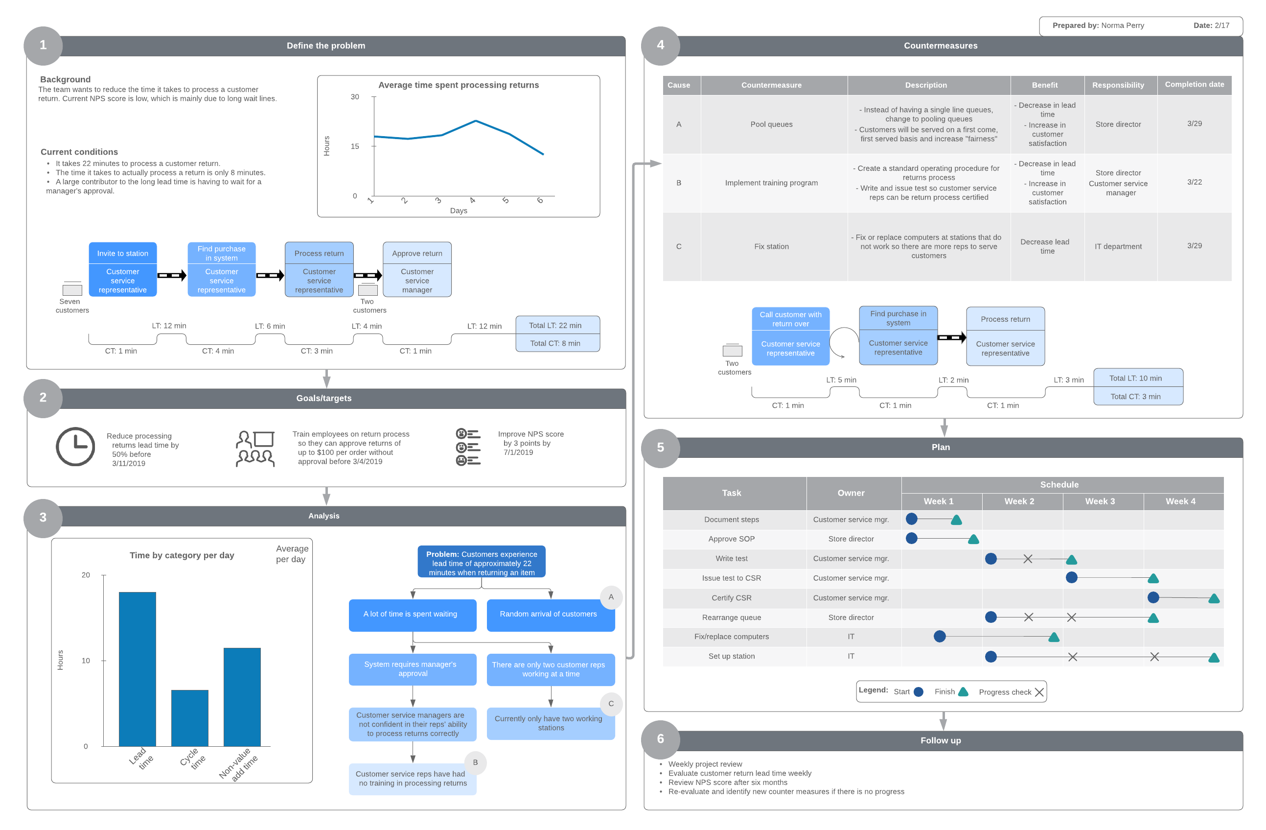
An A3 report is a project reporting method that condenses information from numerous analyses into one succinct visual. Highlighting information such as the project’s background, analysis, goal, implementation plan, and follow up, these “one-pagers” can assist with short-duration Kaizen activities.
Tools for measuring performance
Performance is best improved when measured and monitored over time. The measurement portion of Six Sigma’s DMAIC strategy asks teams to collect accurate data regarding their processes’ performance in order to determine the root of any inefficiencies or problems. With data in hand, you can more precisely implement the right improvements to your process.
Measurement system analysis (MSA)
An MSA seeks to analyze a process’s variability within five main parameters: bias, linearity, stability, repeatability, and reproducibility. By assessing the equipment, procedures, people, and management techniques involved in a process, teams can take stock of overall performance and make improvements where necessary.
Histogram
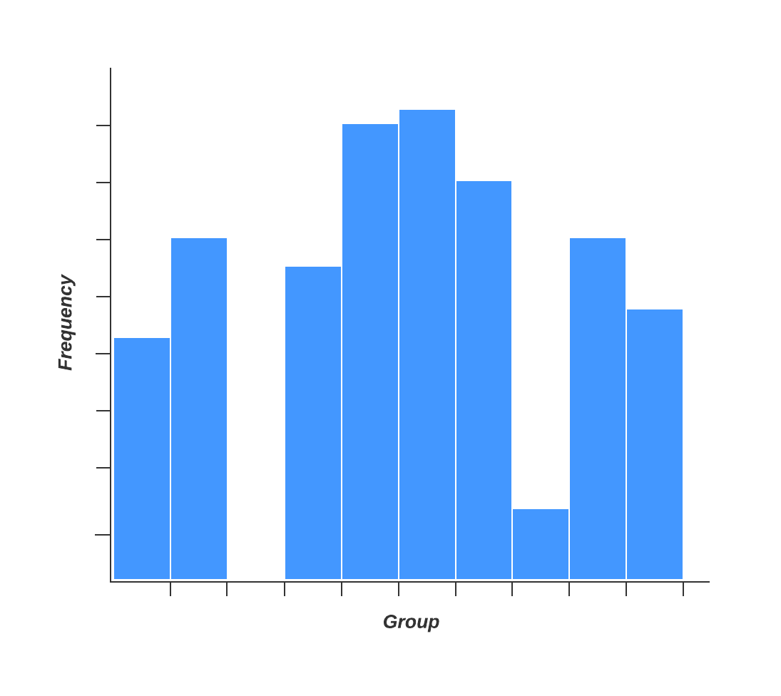
Easily measure your process’s performance by charting the frequency of various outcomes with a histogram. Similar to a bar chart, a histogram provides a clear depiction of process variation, letting you analyze your process outcomes against customer needs and desired results. If your histogram yields an uneven dispersion of data, your team can get to work on process improvements.
Tools for controlling processes
Successfully improving a process involves much more than a one-time implementation. The final stage of the DMAIC strategy calls for continuous control and improvement of a process in order to maintain its effectiveness over time. Your process may require additional changes as you spot inefficiencies, your organization evolves, or customer needs change.
Statistical process control (SPC)
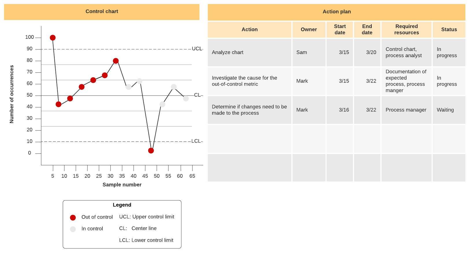
A well-made statistical process control chart is designed to help teams separate common-cause variation from special-cause variations to ensure that any solutions you’ve implemented are maintained. Similar to a histogram, a SPC chart allows you to analyze data over time, within control limits, to assess whether a process is statistically viable over time.
Individual and moving range control chart (I-MR chart)
An I-MR chart provides a visual display of process variation over time, so you can eliminate variability and inefficiencies based on statistics. The data in an I-MR chart can potentially signal when a process might go out of control and which sources of special cause variations might be the culprit.
Control plan
A control plan serves to document the varying elements of quality control that need to be implemented in order for your processes to deliver products and services that meet your quality standards. In the end, you should have a formally documented system of control. Your control plan may include variables like process reviews, corrective actions, inspection requirements, and more.
Properly implementing Six Sigma tools within your process improvement strategy can lead to leaner, more effective processes that meet your customers’ needs without wasting time or resources.
Lucidchart can help you through each stage of your process improvement, from planning to maintenance. Armed with professional-quality visuals and our collaborative functionality, you can communicate entire processes at a glance and keep your team aligned on project goals.
Sign up for Lucidchart today to give your team the tools it needs to start improving.
About Lucidchart
Lucidchart, a cloud-based intelligent diagramming application, is a core component of Lucid Software's Visual Collaboration Suite. This intuitive, cloud-based solution empowers teams to collaborate in real-time to build flowcharts, mockups, UML diagrams, customer journey maps, and more. Lucidchart propels teams forward to build the future faster. Lucid is proud to serve top businesses around the world, including customers such as Google, GE, and NBC Universal, and 99% of the Fortune 500. Lucid partners with industry leaders, including Google, Atlassian, and Microsoft. Since its founding, Lucid has received numerous awards for its products, business, and workplace culture. For more information, visit lucidchart.com.
Bring your bright ideas to life.
By registering, you agree to our Terms of Service and you acknowledge that you have read and understand our Privacy Policy.
