Every day there are approximately 4.9 billion people using the internet to read the news, buy products, book vacations, watch movies, and much more. Every click generates valuable data that companies can use to help them create a better experience for their customers.
As increasing amounts of data are generated, collected, and stored in data centers around the world, It’s more important than ever that you can quickly analyze and understand what the data is telling you so you can make informed decisions.
This is where data visualization comes in. Graphics and other visuals are generally easier for people to understand than pages of written text, numbers, and statistics. So in order to more effectively interpret and communicate what your data means, it is important to present it visually so all stakeholders can digest it quickly and make better decisions.
What is real-time visualization?
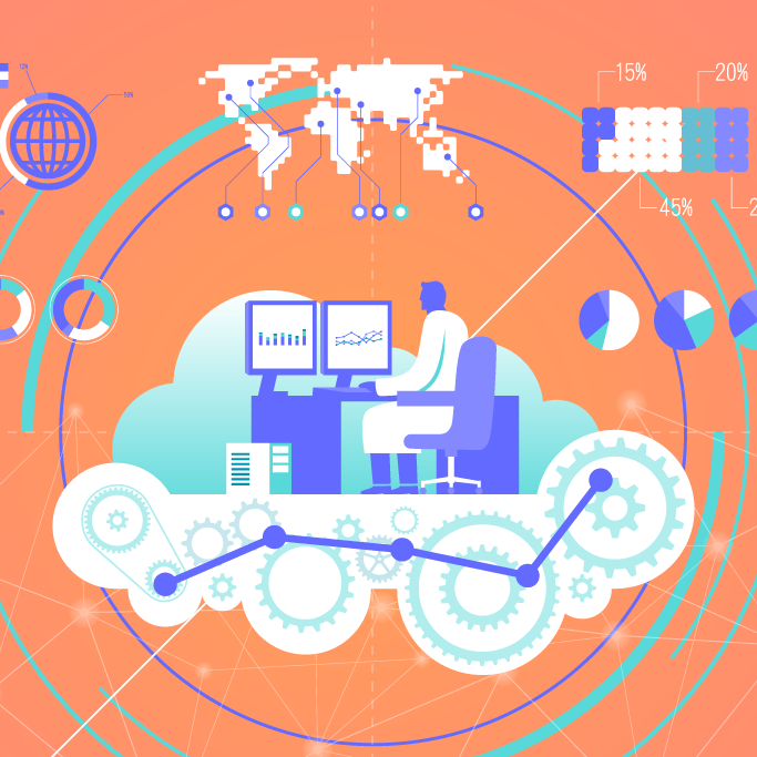
Data visualization is simply a graphic representation of your data. Our eyes are drawn to colors and shapes. So using colorful circles, squares, lines, and other shapes to create charts, maps, and graphs makes it easier for you to group data into categories and to present it in more interesting ways. The visuals grab your attention and keep your eyes focused on the information. This helps everybody to digest and understand the data and identify trends and patterns.
Real-time data visualization takes visuals to the next level by letting you update charts and graphs in real-time. Having real-time data available helps stakeholders to make better decisions that are based on actual data rather than on intuition.
What are the benefits of real-time data visualization?
Real-time data visualization, or live data visualization, is a great way to present data when it is done correctly. It’s done correctly when your intended audience can understand what the data is telling them instead of asking a bunch of questions about what they are looking at. Following are some of the benefits that you may see with live data visualization.
Information is easier to understand
There is so much information being generated every day. It’s impossible to absorb all that information by looking at the raw data. Our eyes can process visual cues faster than written text and numbers. And visuals help us to store and remember information longer. And when people understand what the visual data means, it’s easy for them to quickly absorb and interpret new data as it is updated in real-time.
Quickly extract relevant insights from large data sets
Data visualization gives everybody valuable insight into how different data sets are connected to each other. This helps you to quickly identify and extract patterns and trends that would otherwise be hidden in the raw data and much harder to find.
This information is crucial because it can show profits, losses, and return on investment. This helps you to see where you can maximize your profits, remain relevant in your industry, and meet your customer needs.
A better understanding of business operations
Real-time data visualization tools give you an overview of the relationships among various business operations. This lets senior management and other decision-makers analyze and manage critical business metrics. This helps them to dig deeper into their business data to see what is working and what can be improved.
Faster decision making
Visualization makes data transparent so that decision-makers can comprehend and make decisions faster. The real-time data helps them make decisions that significantly impact the organization. For example, the data can help sales managers to see where the sales team should concentrate to close sales more quickly.
Better customer analysis
Real-time visualization tools can help you to analyze customer data that will reveal what they think about your brand, how they talk about your brand if they are recommending your brand to friends on social media, and so on. This gives you insights that let you understand your target audience, their pain points, their preferences, and what they like. Knowing how your customers think helps you to shape a business strategy that addresses specific customer wants and needs.
Easily modify data for different audiences
Visuals let you present the same data to different audiences in different ways. For example, executives may only be interested in seeing a high-level overview of data, while developers want more details.
Save valuable time
Without visualization tools, employees would have to dedicate a lot of time to scan through the raw data and extract information for reports, create and modify dashboards, respond to specific data requests, etc. Slogging through mountains of printed data can be tedious and cumbersome. And significant trends and patterns can be missed.
Encourages data interaction
Because data visualization tools help you to easily categorize and group data, it encourages employees to spend more time interacting with the data. The more interaction with the data, the more understanding each team member can gain. More understanding leads to better ideas and unique problem-solving. Real-time data visualization can help you to design and create actionable business solutions.
What are some data visualization best practices?
Before you start throwing shapes and colors around in an effort to present data visually, you need to put some thought into the presentation and what you want to accomplish. To help you to figure out which data to select and how it should be presented, here are some tips and best practices to get you started.
Understand your goal
Not all data is relevant or of interest to everybody. So it’s not just a matter of simply charting or diagramming all data and expecting each audience to get what they need from it. Every audience is interested in different data sets, so you can’t take a one-size-fits-all approach to create your data visualizations. Even the prettiest and cleanest presentation is no good if the audience doesn’t need or understand the data in it. With that in mind, your goal should be to understand:
- Who is the target audience?
- What is the message you want to communicate?
- What specific questions does the data answer?
- Which data sets will keep the target audience engaged?
Answering these questions doesn’t mean that you need to create a different presentation for every stakeholder who might look at it. Instead, target similar groups of people who might be interested in the data. For example, the sales team will be interested in a different set of data than the developers.
Choose the right visuals
There are many different visual ways to present your data. You’ll want to choose the format that is best for telling the data’s story and answering the questions of its intended audience. To figure out which visual format is best, it helps to understand different types of data visual categories.
- Temporal: This category presents data in one-dimensional, linear formats. Visuals include stand-alone lines or lines that overlap. These are familiar charts that include a start and finish time such as, line graphs, timeline schedules, Gantt charts, and so on.
- Hierarchical: Data in this category is presented as groups branching out from an origin group. For example, tree diagrams and sunburst diagrams.
- Network: This category includes data sets that connect to other data sets. The visualizations show how data sets relate to each other in a network. Visuals include matrix charts and node-link diagrams.
- Multidimensional: Data sets include two or more variables and many layers. Because of this, multidimensional visuals tend to be eye-catching such as Venn diagrams, pie charts, and scatter plots.
- Geospatial: These data visualizations relate to physical locations and highlight the connection between data points. For example, data can display market penetration on a global scale. Visuals include flow maps, density maps, cartograms, and heat maps.
Keep visualizations simple
People need to be able to look at and digest the information quickly. The more simple and lean the presentation, the easier it is for your audience to see relevant information and make sense of important relationships. Simple visuals give you a quick high-level overview of important information and links to more information as needed.
Educate and empower your audience
The overall goal of data visualization should be to educate and empower your audience. The visuals should help everybody to understand why data and analytics are important. Good visualizations will encourage employees and stakeholders to engage with real-time, up-to-date data and frequent calls to action to keep everybody on the same track working toward the same goals.
Where can you get help?
No matter how you choose to format your data visuals, Lucidchart has a large library of templates that can help you to create any type of map, data flow, matrix, and diagram that you need to tell your data’s story. You can easily modify existing templates to meet your needs or create your own from scratch. Simply drag and drop shapes and lines to the digital canvas to create compelling and interesting visual representations of your data.